
Chart Dump
The Good, The Bad and The Ugly

Earlier this week I spoke about the fact that I was taking some money off the table ahead of the FOMC. Not because I was bearish, but because there were a number of things happening in the markets that had me more spooked.
The primary driver here was the spike in the SOFR rate, a sign that short-term funding costs were tightening and that liquidity in the banking system was under stress — not the backdrop you want to be overexposed in. The fact that the spike in the SOFR rate coincided with a 2% intraday drop in KRE compounded this view.
Thankfully, this looks to have been a nothing burger.
Following the 9bps pop on Monday, the SOFR rate cooled to the tune of 12bps by Tuesday afternoon. KRE also recovered its losses.
What this suggests - in the short term at least - is that the pop in SOFR was likely the result of banks settling their quarter end tax obligations, rather than an out and out liquidity scare.
So where does that leave us?
Following the usual whipsaw that comes with an FOMC presser, my focus isn’t on the noise of the immediate reaction but on where markets actually settle as we head into the weekend. That’s when the dust clears and you get a truer picture of positioning.
Right now, economists and self-styled market gurus are tripping over themselves to decide whether Powell sounded hawkish or dovish, and whether a 25bps cut should be read as bullish or bearish.
To me, that kind of analysis misses the point. The Fed’s language is always open to interpretation, and trying to pin a single “takeaway” on it is a fool’s errand.
Instead of playing that game, I’d rather watch how the market itself interprets the message. Price action is the final arbiter, and the charts are where that truth gets written in real time.
In this post, I’ll walk through some of the most telling setups I’m watching—broken down into three categories: the good (bullish opportunities), the bad (bearish setups), and the ugly (trades to steer well clear of).
The Good
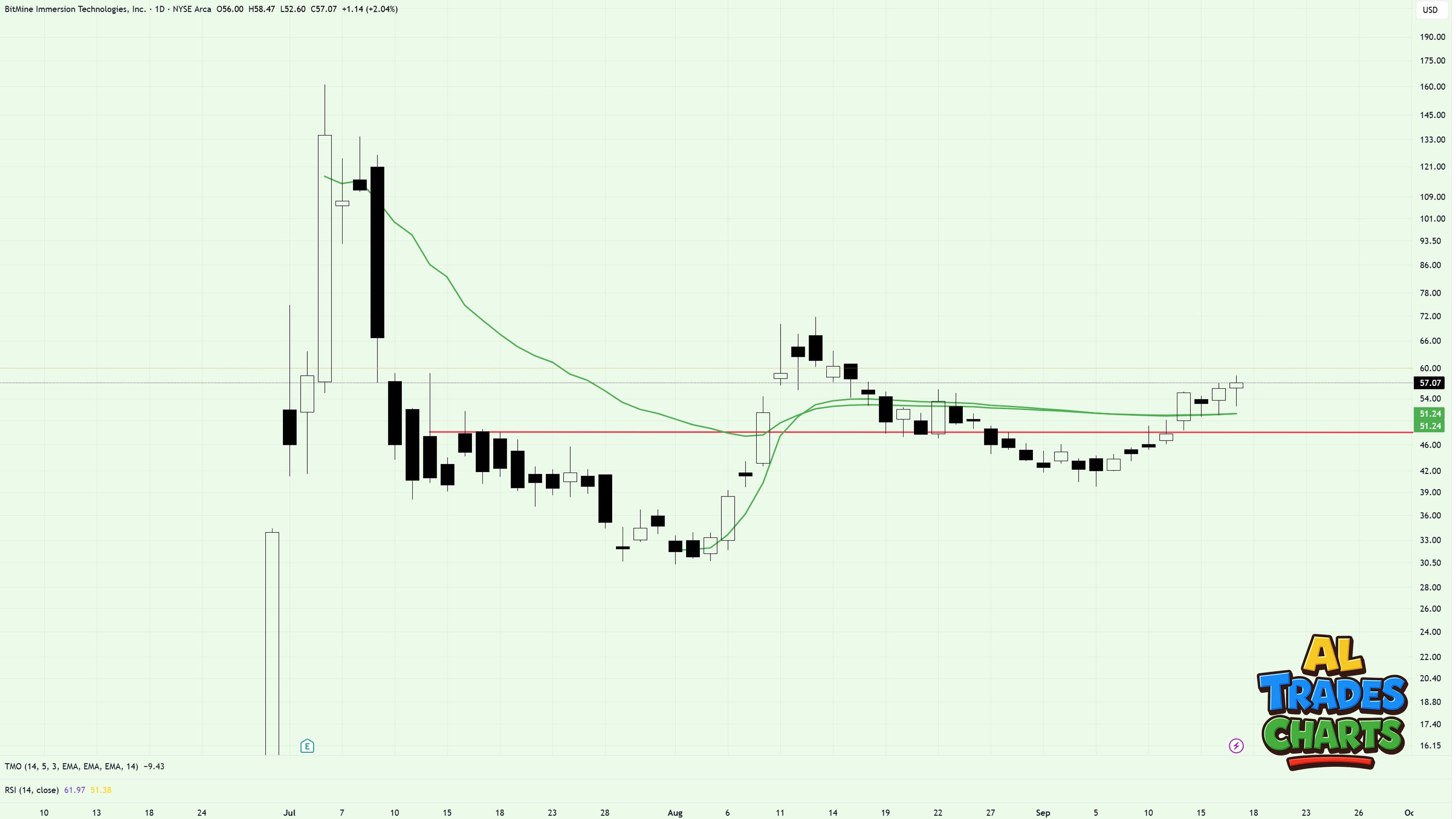
Kicking things off is Tom Lee’s love child, BMNR.
Since September 5 price hasn’t closed below the prior day’s candle once, holding above key pivots and reclaiming the VWAP from the August low and the July high in the process. On this chart, the latest pivot is in red, whilst the VWAPs are in green.
Having already traded this ticker a number of times over the last few weeks, my latest position is the 60C set to expire tomorrow. Should price continue to move in the right direction (holding above the prior day’s close is the key tell here) then I may be tempted to add more, pushing the expiry out into late September or mid October.
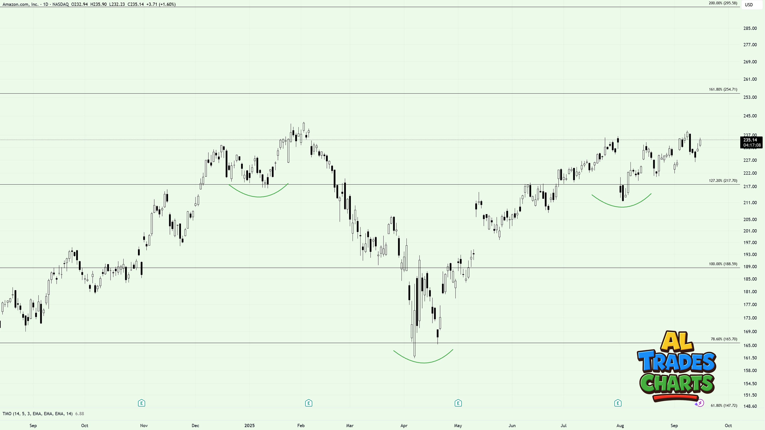
Amazon is lagging other MAG7 names but this chart looks anything but bearish in my view. Note the inverted H&S pattern that’s been in play for a number of weeks as traders look for the illusive pop to new all time highs. I’m in calls here, targeting a move towards the next key fib at $254. But first, there’s some strong resistance at $238 that bulls need to break above.
Should we see this move breakdown, my line in the sand sits at $226 - the prior week’s low.
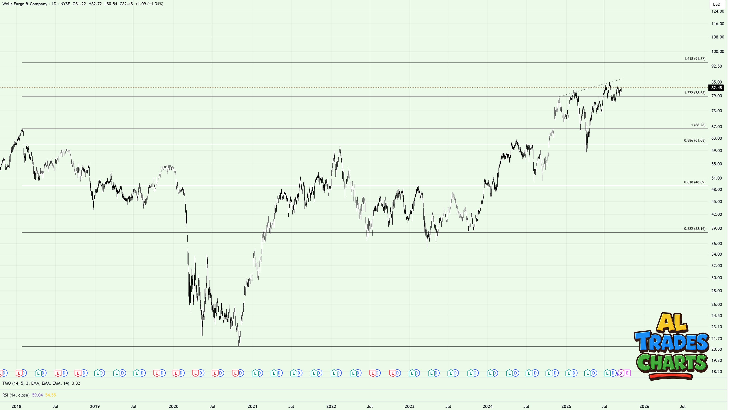
Wells Fargo isn’t the sexiest ticker to trade but if you take a long term view, it’s notable how well its respected the key fibs set from the 2018-2020 bear market.
Right now price is holding above the 1.272 level having formed an inverted H&S pattern. If this plays out and we see a break above the neckline at $87-$90, then I wouldn’t bet against a push towards the 1.618 fib and the $94 mark.
Leaps are probably the strategy of choice here as it’s a slow mover.
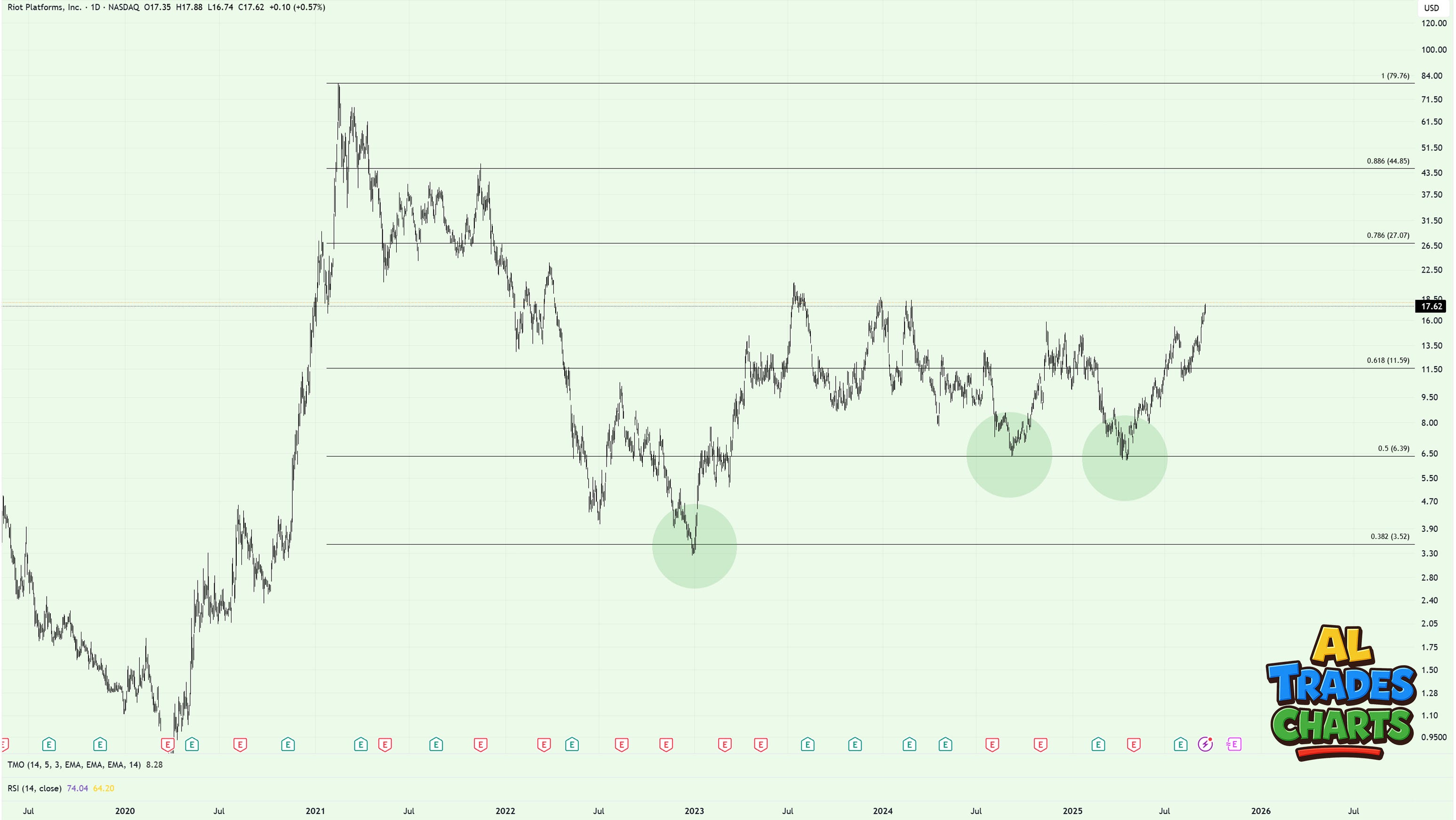
Riot is another ticker that’s respected key fibs over the last few years - although it’s proven a super volatile stock that’s been infuriating to trade. But with price looking to break above key resistance, the door to $27 remains ajar.
Can the bulls get this thing going above $20 a share this cycle? My bet is yes, they can.
I’ve been in leaps for a few weeks now (since price was trading at $12 a share) and I’m happy letting them roll above $15.
The Bad
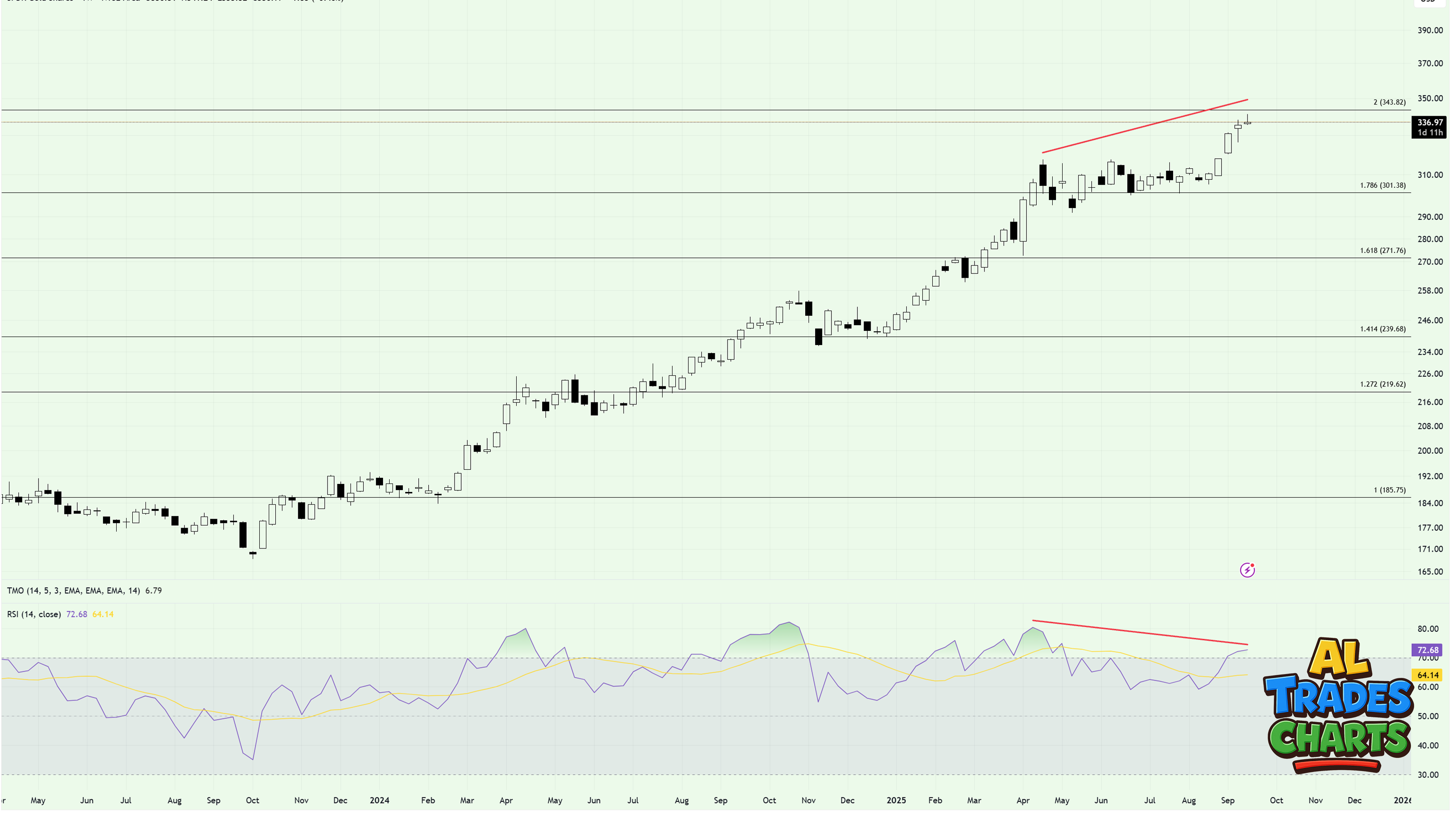
The world and its dog has been long gold on fears of currency debasement/inflation, which has proven to be an awesome trade this cycle. So you’re probably thinking, why is this on the ‘bad’ list?
Sure, Gold has been a solid trade, but right now I’m seeing price failing below a key fib at $343 on what is a notable RSI divergence (weekly chart).
Is this a reason to short the yellow metal? Probably not - but these signals are enough for me to add it to the ‘no go’ list for now. Should price retrace down towards the 1.786 level at $301 then maybe I’ll think about re-entering, but until then, I’m happy rotating out of gold.
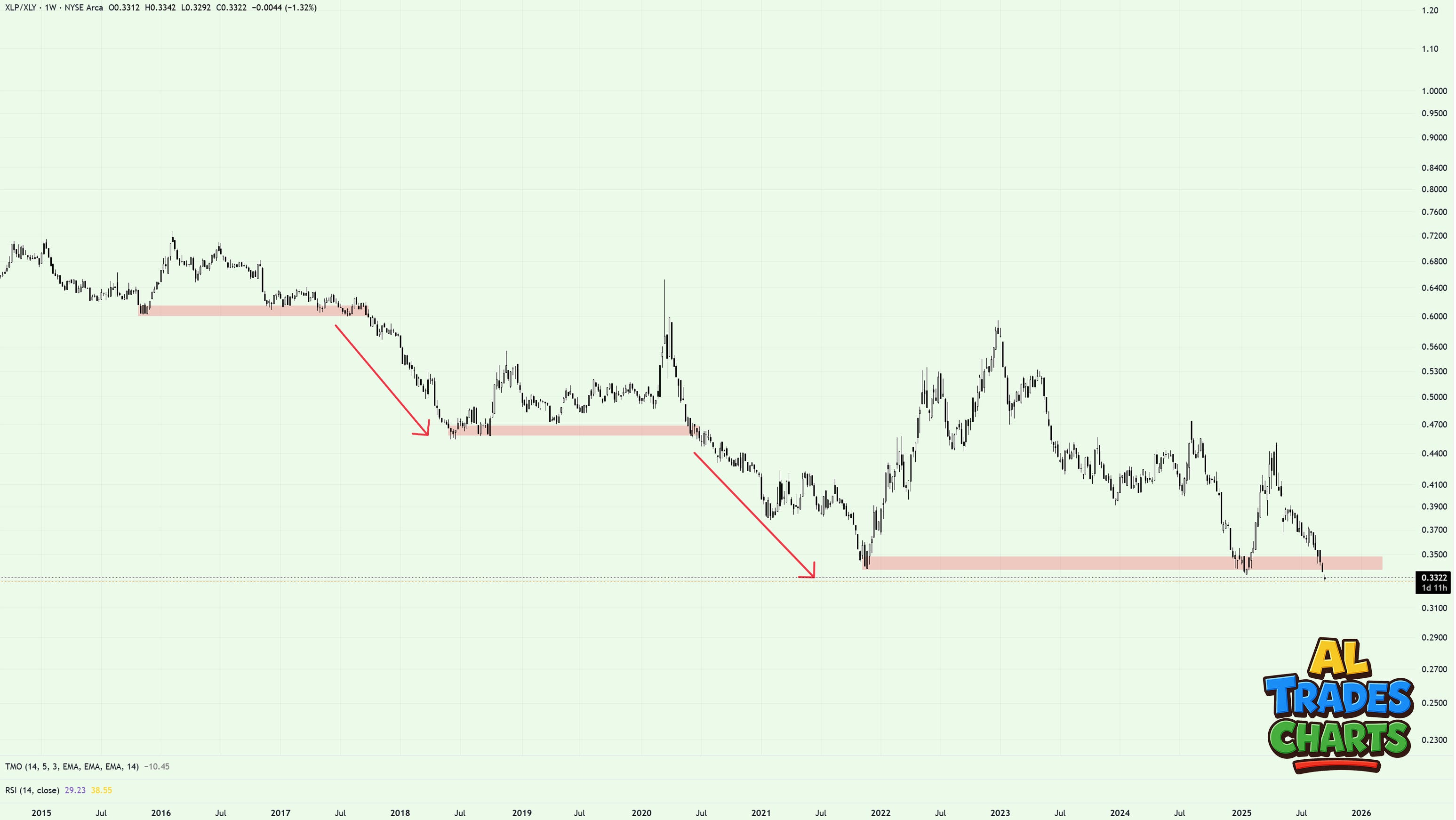
One of the clearest underperformers on my screen right now is Staples (XLP) relative to Discretionary (XLY).
This ratio has been grinding lower for the better part of a decade, and every time it finds support, the floor eventually gives way. We’ve seen this play out in 2016, 2018, 2021—and here we are again in 2025, pressing on another key level.
The pattern is consistent: temporary stabilization, followed by a sharp leg lower. With the ratio breaking down once more, history suggests the path of least resistance is still lower.
That tells us two things:
Staples continue to lag, showing that defensive positioning is not being rewarded.
Discretionary remains in charge, which is usually a bullish sign for risk appetite more broadly.
In short, the Staples vs Discretionary ratio has been a losing trade for years, and until price locks in a higher high, nothing on this chart suggests that trend is about to change.
The Ugly
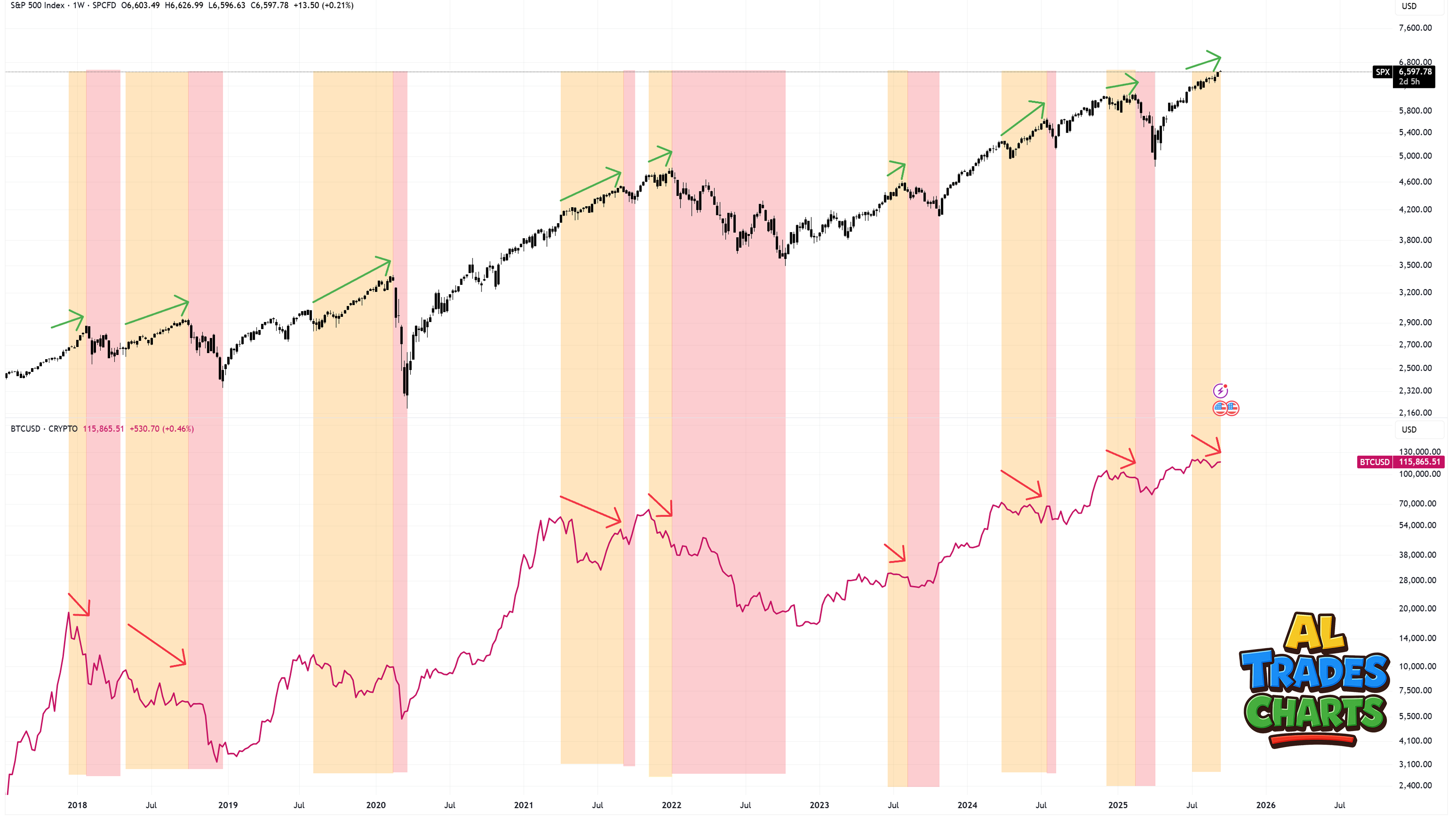
This chart has been making the rounds as a so-called “sell” signal for equities. The setup is straightforward: every time the S&P pushes to new highs while Bitcoin fails to confirm, it eventually resolves with stocks rolling over.
The history is compelling—these divergences have preceded pullbacks more than once. But here’s the catch: they almost never play out instantly. In the past, it’s taken weeks for the signal to matter, and sometimes stocks have rallied higher in the meantime.
In today’s case, the divergence only stands if Bitcoin stays capped. If Bitcoin rips to new highs, this whole “signal” evaporates on the spot.
Which is why I laugh when I see people slapping this chart on X like it’s a red button to short everything. That’s not analysis, that’s cosplay. If you’re using this as a stand-alone sell signal, you’re not trading—you’re LARPing.
So yes, keep an eye on it. But don’t confuse an interesting divergence with a green light to hit the eject button.