

Last week’s newsletter aged like milk.
In it, I spent a fair chunk of it highlighting charts that explained my cautious tilt on the market - and, FWIW, I still think many of those charts remain valid - only for the market to completely ignore me and soar higher while I sat on the sidelines.
This, naturally, prompted a bit of a reassessment: what was I missing?
More importantly, what could I have been looking at that might have allowed me to participate rather than watch from the sidelines?
That’s what led me to the collection of charts and tools detailed in this post.
It happens; it’s all part of the game. I’m nowhere near the complete package, but that’s kind of the point - the aim is to keep learning, refine the process and, hopefully, get a little better at putting my chips to work whilst those around me lose theirs.
Dancin’ While The Music Plays
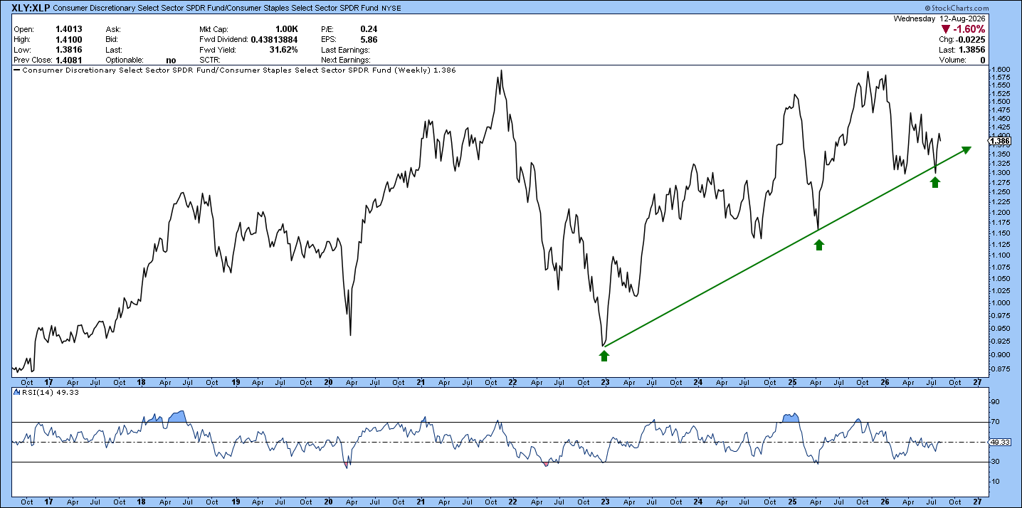
Every trader has their north star charts. One of my personal favourites is XLY/XLP, which tracks the relative performance of discretionary stocks against staples.
What does it show? Pretty simple. Discretionary stocks have been trending higher relative to staples since markets bottomed in late 2022.
And that makes sense in the context of this bull market: when investors are confident, they tend to favour the more economically sensitive, higher-beta names in consumer discretionary.
For me, XLY/XLP is less about predicting the S&P 500 and more about answering a simple question: are investors leaning into risk, or hiding from it? Right now, the answer remains firmly in the former camp.
High Beta, Steppin’ Up
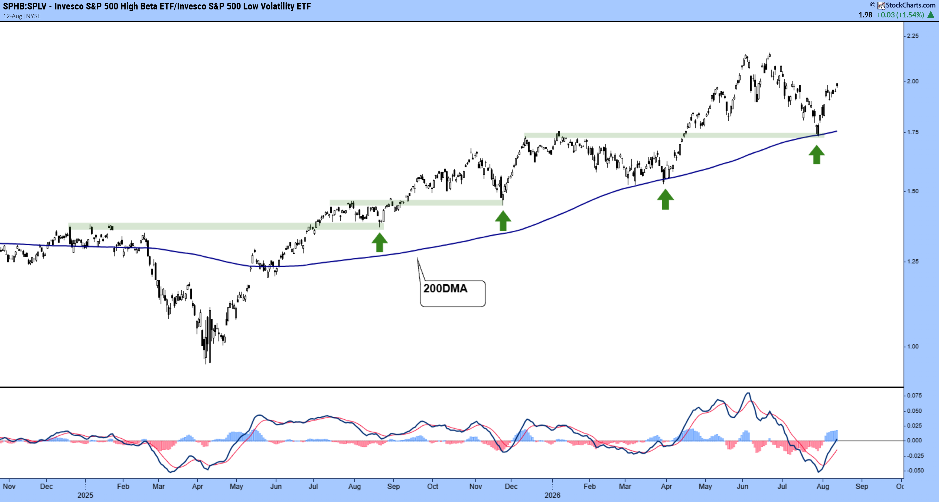
Another north star and another one from last week’s post: high beta vs low vol.
When the former outperforms the latter, the bulls are in control. And just look how orderly this grind higher has been - with price consistently flipping prior resistance into support above a 200dma.
So long as the trend holds and we continue seeing higher highs and higher lows, I see no reason to panic here.
Breadth Leading Price
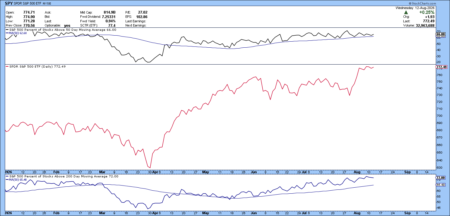
Despite the market’s bifurcated nature (more on that later) breadth remains healthy across the board. Both the percentage of S&P 500 stocks trading above the 50dma and 200dma remain above the historical average, trending higher above rising 50dmas.
Typically, breadth leads price. So if these levels start to falter, then tightening up stops or even exited positions isn’t the worst looking play. But given where we are right now, I’m more than happy to let my positions ride.
Three PPOs, One Clear Message
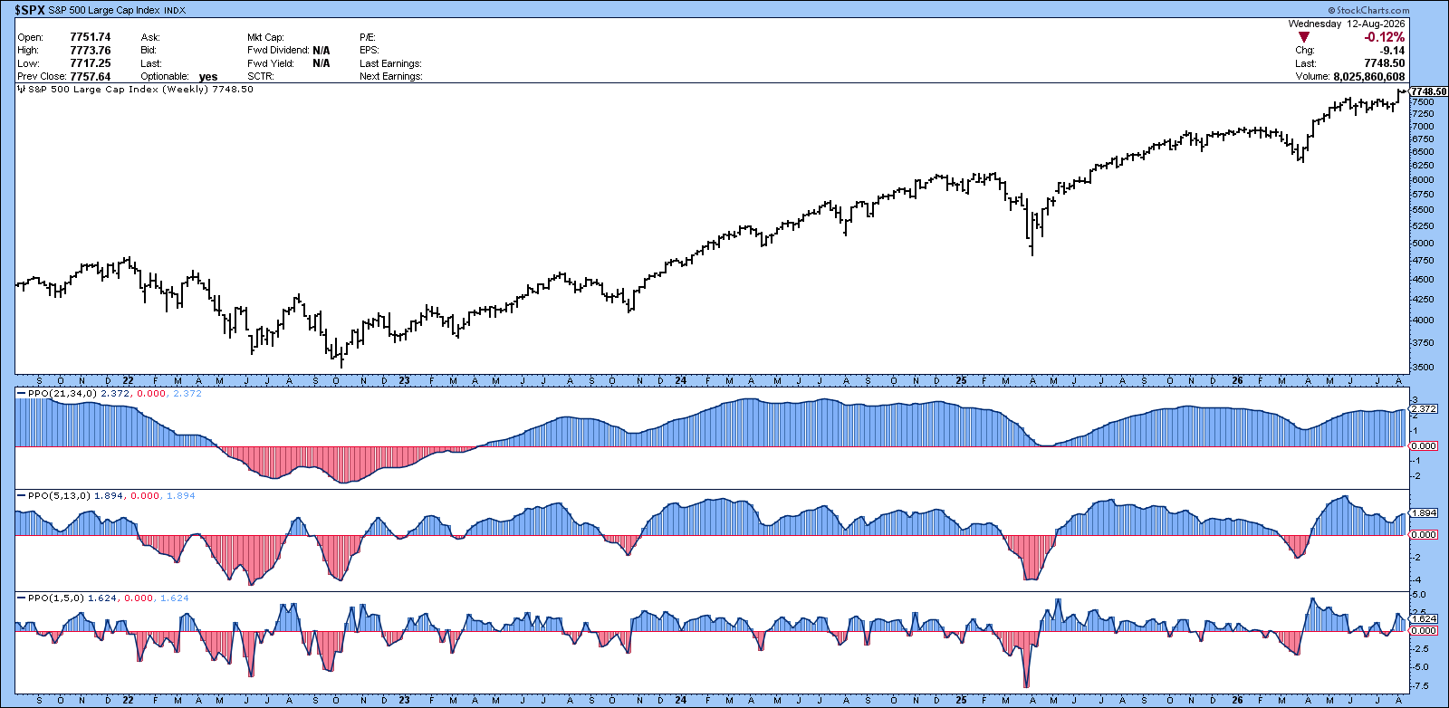
Here’s one I picked up from David Keller.
A great way to gauge the underlying health of the market is to look at PPO (Percentage Price Oscillator) across multiple timeframes.
PPO is essentially a momentum gauge, showing whether a faster moving average sits above or below a slower one. Here I’m using three speeds - 21/34 for long-term momentum, 5/13 for intermediate momentum and 1/5 for short-term momentum - to see whether the bullish trend is broad-based across timeframes.
Right now, all three are above zero, which is a pretty compelling signal.
Despite the occasional short-term wobble, momentum has repeatedly reset and reasserted itself, while the longer-term PPO has remained firmly positive since early 2023.
With the S&P 500 sitting near all-time highs, the message is pretty simple: the trend remains bullish, and there’s little evidence here yet of a meaningful change in regime.
Rotation, Rotation, Rotation
In my early days as an investor I was consistently guilty of looking in the rear-view mirror - focusing on the best-performing sectors at the highs and largely ignoring the rotation playing out beneath the surface.
In other words, I was skating to where the puck had been rather than where it was going. Worse still, I spent way too much time trying to predict market tops and bottoms - buying into whatever theory was in vogue that week (banking crisis, Yen Carry Trade…sound familiar?).
These days, using the collection of tools I’ve outlined in this post, I like to think I’m a little more disciplined about looking beneath the headline performance and identifying where the next trade might be.
Hopefully these charts will help you do the same.
Best,
Alex