
Leading Economic Indicators
They're lying to you...


I’m not an economist.
But given said collective’s record when it comes to forecasting economic output and equity performance, I’m definitely not complaining. As the old saying goes, the only reason God created economists was to make weathermen look good.
At the time of writing, the usual suspects are doing their best to scare you.
This includes the leading academics you’ve seen doing the rounds on the BBC and CNBC, as well as some of the more niche names you’ve undoubtedly come across on social media.
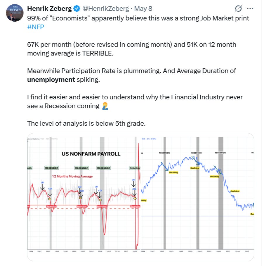
Here’s a smart-sounding take from Henrik Zeberg, shared last week…
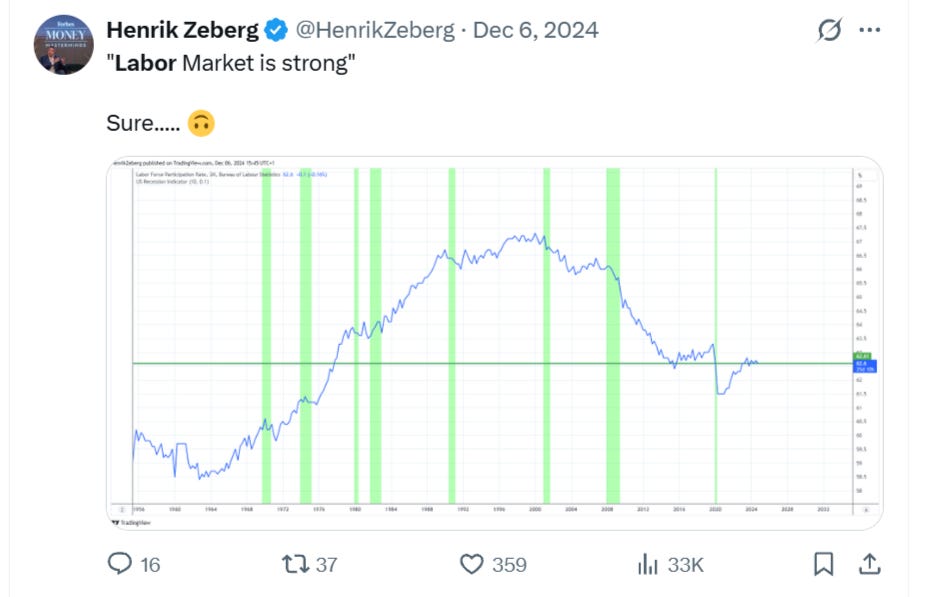
And here’s another, equally smart sounding take from the same account, posted back in December 2024 - just months before we saw one of the greatest bull runs in recent memory…
The point here isn’t to dunk on the likes of Henrik Zeberg or any other economist for that matter. I’m sure they have their reasons for being so bearish on the economy (those subs won’t sell themselves!).
Instead, I’d simply like to highlight that for as long as I can remember, economists have been getting it wrong. Or to put it bluntly, straight up lying to us for years.
Data Don’t Lie
Human beings lie all the time. Whether we’re lying to ourselves or others, it’s just part of the deal.
But data is different.
Data doesn’t care about political affiliations, TV ratings, engagement farming, or whether some economist on CNBC needs to justify the forecast they made six months ago.
It just is.
That doesn’t mean data can’t be interpreted poorly. It can. But raw numbers don’t wake up in the morning deciding to push a narrative. They don’t get emotional. They don’t go on podcasts. They don’t panic because the S&P is down 2% or suddenly declare a “new paradigm” after three green candles.
And that’s why I started building my own economic dashboard.
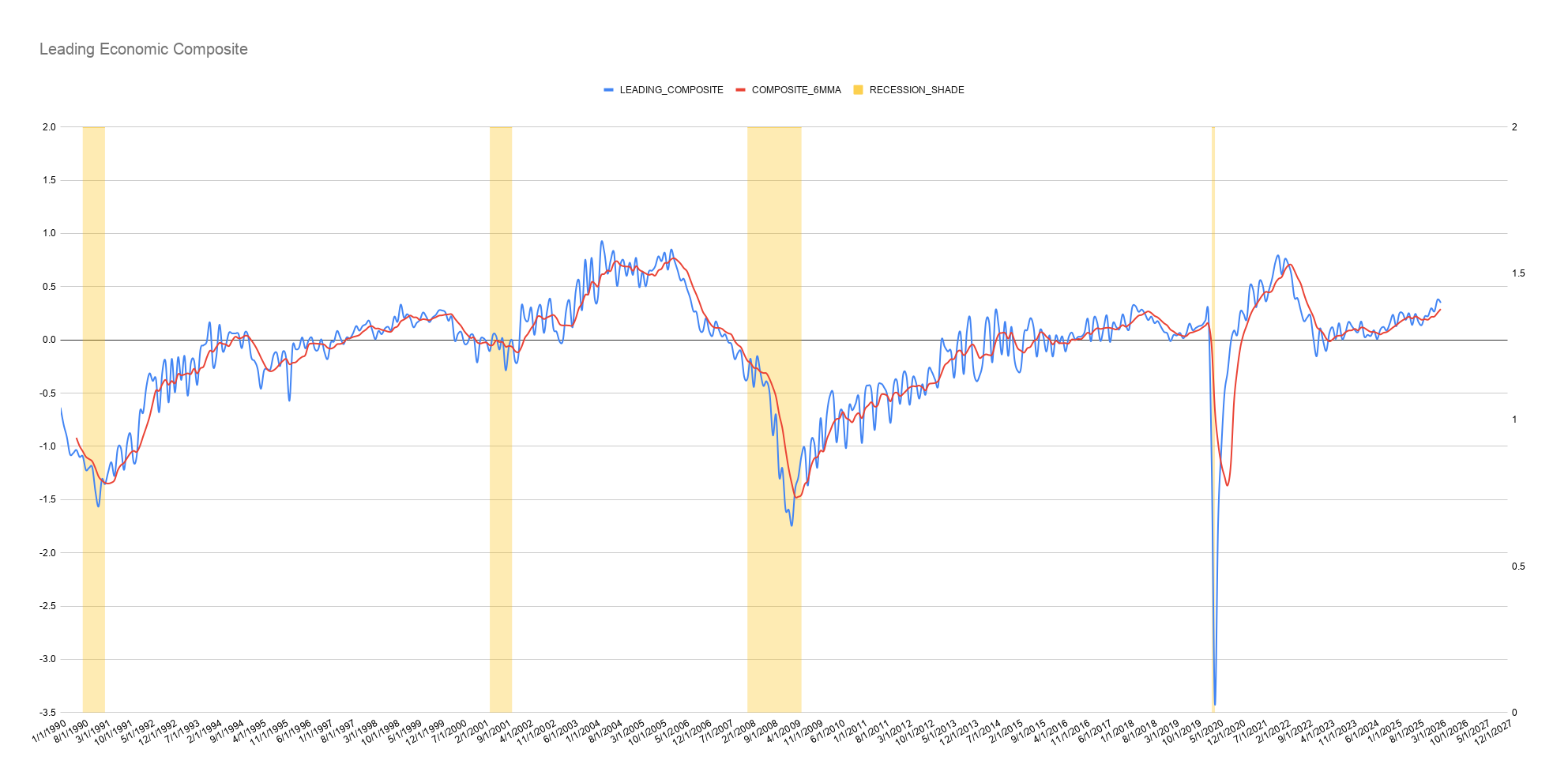
What you're looking at here is a composite of leading indicators, namely: building permits, housing starts, single family permits, 10Y-2Y spreads, initial jobless claims, weekly hrs worked and manufacturing orders from 1990 to March of this year.
The red line shows the 6mma, yellow shaded areas are recessionary periods.
What you'll notice is that prior to each recessionary period shown on the chart, leading indicators trended lower for a number of months (24 prior to the 2008 GFC) prior to each recession hitting.
No duh, leading indicators doing exactly what they're supposed to do!
Where Are We Now?
Just look at the chart.
When the composite moves from the bottom left to the top right, it signals the US economy is in an expansionary phase - good news for bulls.
When the opposite happens - and the blue/red lines trend lower - contraction is in play, often preceding recessionary periods like those witnessed in 2008.
Right now, both lines are trending higher, having recovered strongly after the slowdown seen throughout 2021 and 2022 - which, not coincidentally, aligned with the market’s last meaningful bear market.
Could this change as early as next month? Sure - but trying to predict it is akin to reading tea leaves. So for now I’m happy sticking with the data we actually have.
On that note, it’s important to understand that economic data is never truly “live.” Almost every datapoint in this chart is released with a lag. Building permits, manufacturing surveys, employment data, claims, credit conditions - they all arrive weeks after the month they actually represent.
In other words, we’re always looking slightly through the rear-view mirror.
But markets are forward-looking.
That’s why I focus less on individual data points and more on the direction of the composite itself.
Is the weight of the evidence improving or deteriorating?
Are leading indicators stabilizing or rolling over?
Is economic momentum accelerating or fading?
Right now, despite all the doom-scrolling, panic headlines, and endless recession predictions, this chart simply doesn’t look like an economy in collapse.
Have a great week.
Best,
Alex