
Make Mine a Soft Drink
Taking it Easy in the Midst of a Bull Market Frenzy


Last week, I likened the bull market to a party — urging readers to stay on the dancefloor while the music plays, but to keep one eye on the exit in case things turned ugly.
So, did things get ugly last week? Not really. Which, given the potential catalysts, felt like a welcome surprise — at least for those betting the bull still has room to run.
Regional banks (KRE) continued to slide amid fresh fears of dodgy auto loans, while the VIX spiked to a five-month high.
And yet, the S&P 500 closed Friday within 2% of its all-time high — having rallied more than 2% off the overnight low.
Why So Cautious?
As suggested in this post by the awesome SubuTrade, volatility spikes near all-time highs are not features you’d typically associate with a solid and stable market.
In fact, dating back to the 90s, this feature has been synonymous with skittish markets nearing a nadir - most notably the market in 1999 (pre-dot com crash), 2020 (post covid) and 2021 (inflation spikes and rate hikes). Here’s the data shared by SubuTrade:
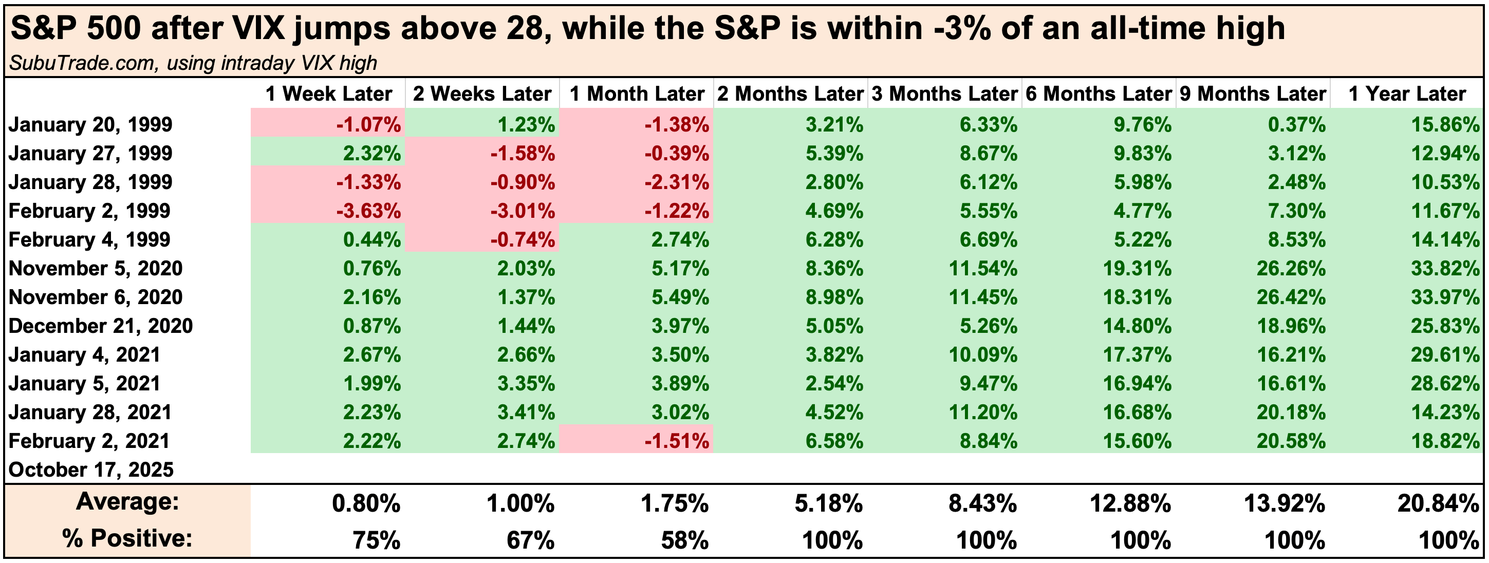
Sure, this data doesn’t look bearish in isolation - with the S&P being higher 100% of time within two months of a VIX spike above 28 with price within 3% of an all-time high. But there’s more to my cautious view than volatility.
Bitcoin
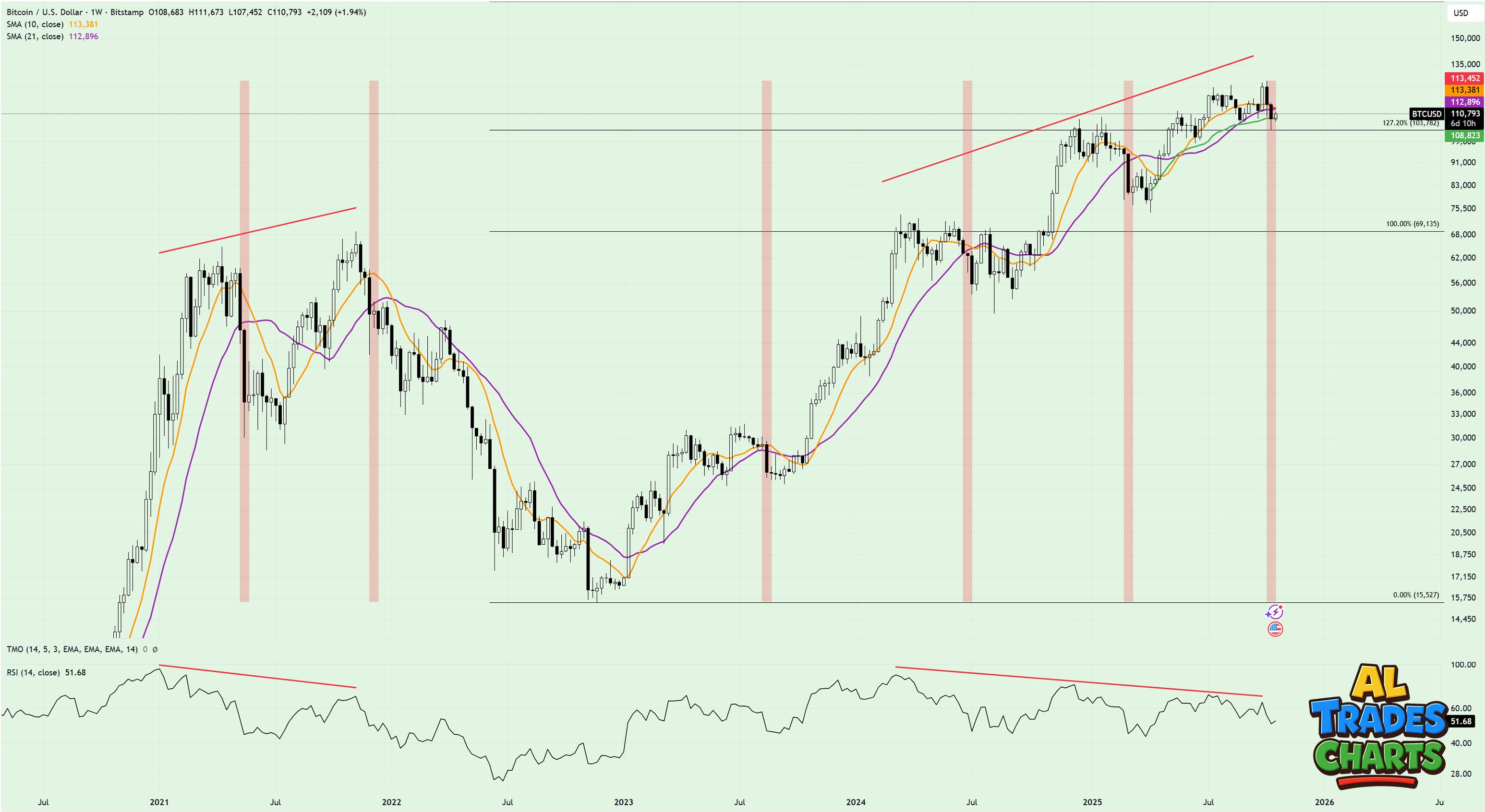
Let’s breakdown this weekly Bitcoin chart:
Vertical red lines: breaks below the 21wma
Horizonal red lines: bearish RSI divergences (price making higher highs while the RSI makes lower highs)
Black horizonal lines: Fibonacci levels drawn from the 2022 bear market low to the 2021 bull market high
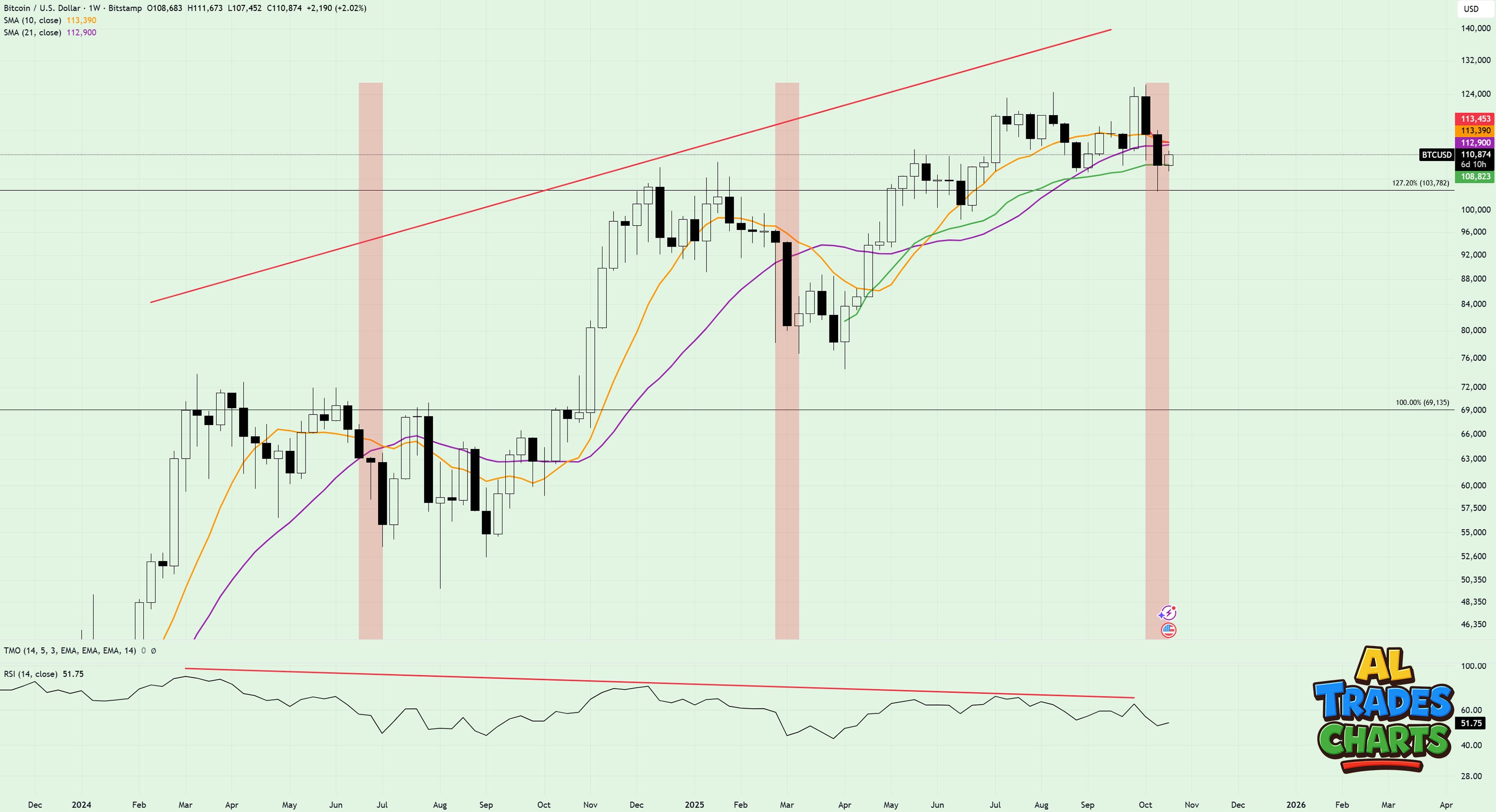
Here’s a closer look showing price action dating back to 2024:
Right now I think this chart is offering mixed signals. On the bullish front, seeing price find buyers at the 1.272 is exactly what you’d want to see during a bull market.
Add to that the sequence of higher highs and higher lows, and it’s obvious that the wider trend is up and to the right.
But what I don’t like about this chart is the break below the 21wma (purple line) and what’s threatening to be an ugly-looking cross of the shorter term 10wma over that same level - the exact same thing that happened during the Q3 shakeout in 2024 the the tariff tantrum in Q1 of this year.
I also did some digging to see how Bitcoin performed in the days/weeks that followed price breaking below the 21wma, and it didn’t make for great reading:
Dating back to 2021, the average drawdown following a close below the 21wma is 30%, with 20.8 weeks the average duration before price reclaims the same key level.
The good news is that this concern could easily be negated should buyers push Bitcoin back above its 21wma, which currently sits at ~$112k.
Should that happen, I’ll welcome it as a return to the ‘risk on’ environment we’ve enjoyed over the summer months. But until then, I’m happy sitting on the sidelines and waiting.
XLP/XLY
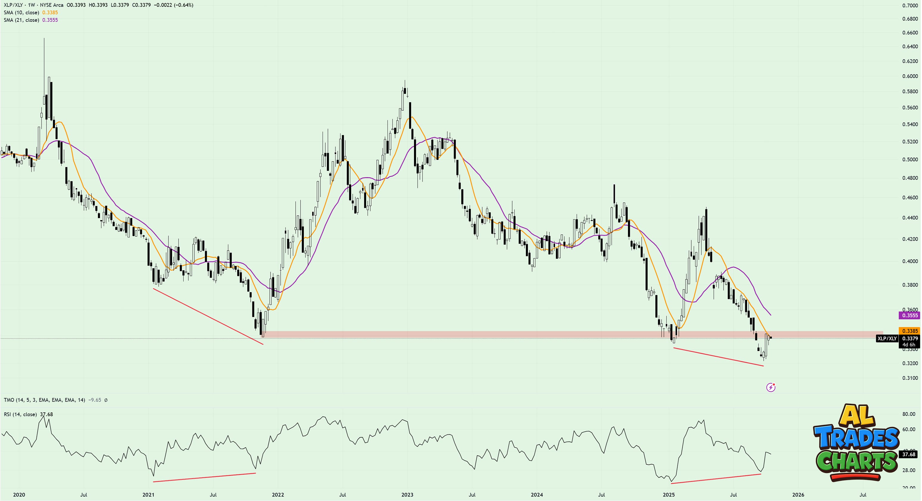
Another reason to tread lightly - in the short term at least - is this chart showing XLP (staples, the boring stuff people buy during ‘risk off’ environments) relative to XLY (discretionary, the fun stuff people buy during ‘risk on’ environments’).
On first glance, this looks like a super bearish chart - exactly what you’d want to see during a bull market.
But what I can’t seem to ignore is the bullish divergence on the weekly timeframe, and the fact that right now, XLP/XLY looks to be retesting the prior lows - threatening the breakdown from that occurred in September.
Like Bitcoin, the potential threat I’m seeing on this chart is easily invalidated:
If price stays below the declining 10wma and continues to fall
If price fails at the red bar and continues to fall
If price breaks to new multi-year lows
At the time of writing, this does seem likely - with SPX again threatening to make new highs whilst crypto assets catch a bid. But I’m not interested in how this chart looks at today’s close.
What I want to see here - at the very least - are back-to-back black candles that hone in on the prior low. If that happens, the odds of the bearish divergence ‘righting itself’ becomes likelier, and the party can rumble on.
Breadth
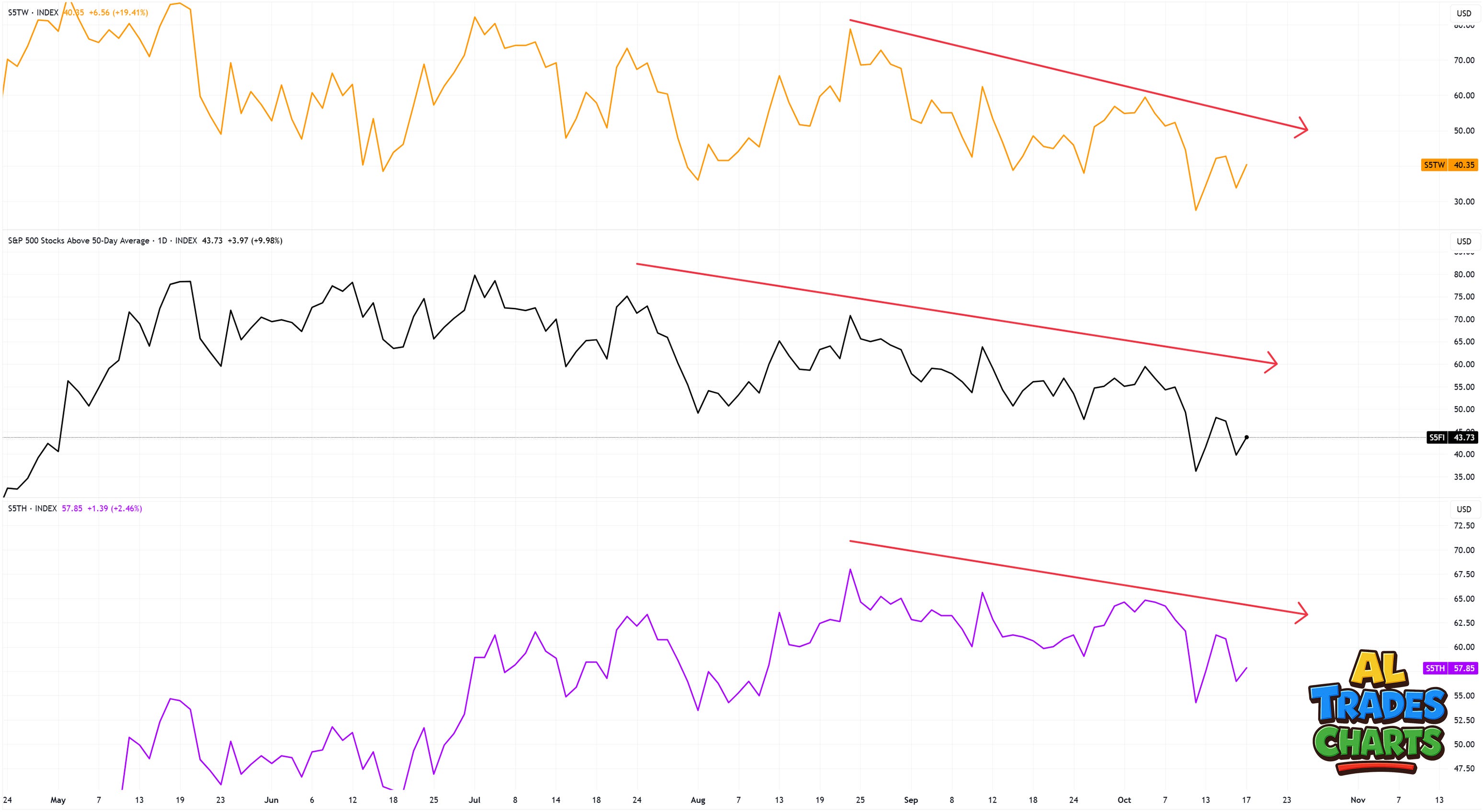
As I mentioned in last week’s post, breadth has looked pretty weak over the last few months. In fact, across all three measures shown on this chart (top panel: SPX stocks trading above 20dma, middle: SPX stocks trading above 50dma, bottom: SPX stocks trading above 200dma) you have to go back to August 22 to find the last higher high.
What this shows is that whilst SPX has remained in a clear uptrend, breadth has been locked in a downtrend for a number of weeks now - not something you want to see if you’re buying calls.
But check out what happened on Friday…that’s right, a potential higher low!
What comes next, nobody knows. But if breadth can show signs of life and lock in a higher high, I’ll again take that as a good sign to load up on calls. But until then, I’m happy - you guessed it - to wait a little longer.
Have a great week.
Best,
Al