


When the portfolio speaks, you’d be a fool not to listen.
And right now, mine is telling me one thing: outside of energy, longs simply aren't working. Tech longs? Brutal.
I won’t bore you with the specifics of what has been playing out throughout July, you know the deal by now - Koreans are getting liquidated, semis are flushing lower and those software stocks that I’ve been monitoring for months now, just can’t seem to break above the 200dma.
Adding to the drama, this week we’ve got the FOMC to contend with, complete with the on-and-off again relationship that’s playing out between the Whitehouse and Iran. Oh, and if that wasn’t enough, how does a slew of MAG7 earnings tickle your wick?
Of course, a few weeks of poor price action doesn’t automatically mean the bull market is over. But it does mean it’s time to stop forcing trades and start paying closer attention to what the market is actually saying.
With that in mind, here are a handful of charts I’m watching most closely over the coming days. None are particularly complicated, but together they paint a useful picture of where money is flowing, where it’s leaving, and whether this latest bout of weakness is simply another shakeout- or something a little more meaningful.
Let’s start with the one that’s grabbed my attention more than any other: XLC.
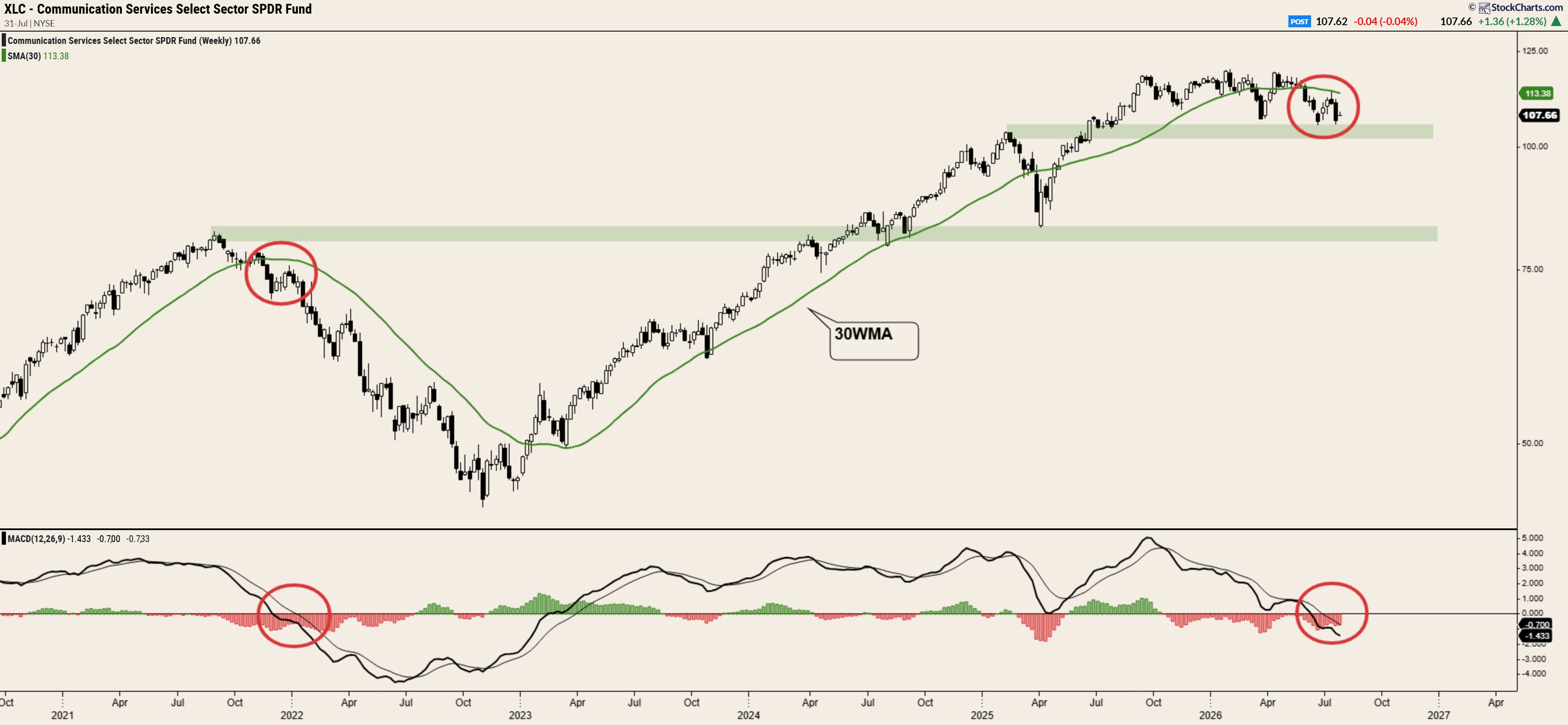
What’s concerning here is that the price action that’s playing out on XLC looks eerily similar to that which played out in November 2021 - two months before the broader market peaked and rolled into a bear market.
Speaking of, the broader market itself isn’t looking all that shiny here either.
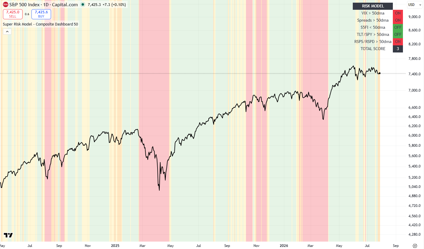
With my Risk Composite model flashing a score of 3/5, we’re back in the amber ‘warning zone’ - with heightened volatility, weakness in discretionary stocks relative to staples and, most alarmingly, widening credit spreads, contributing to the current malaise.
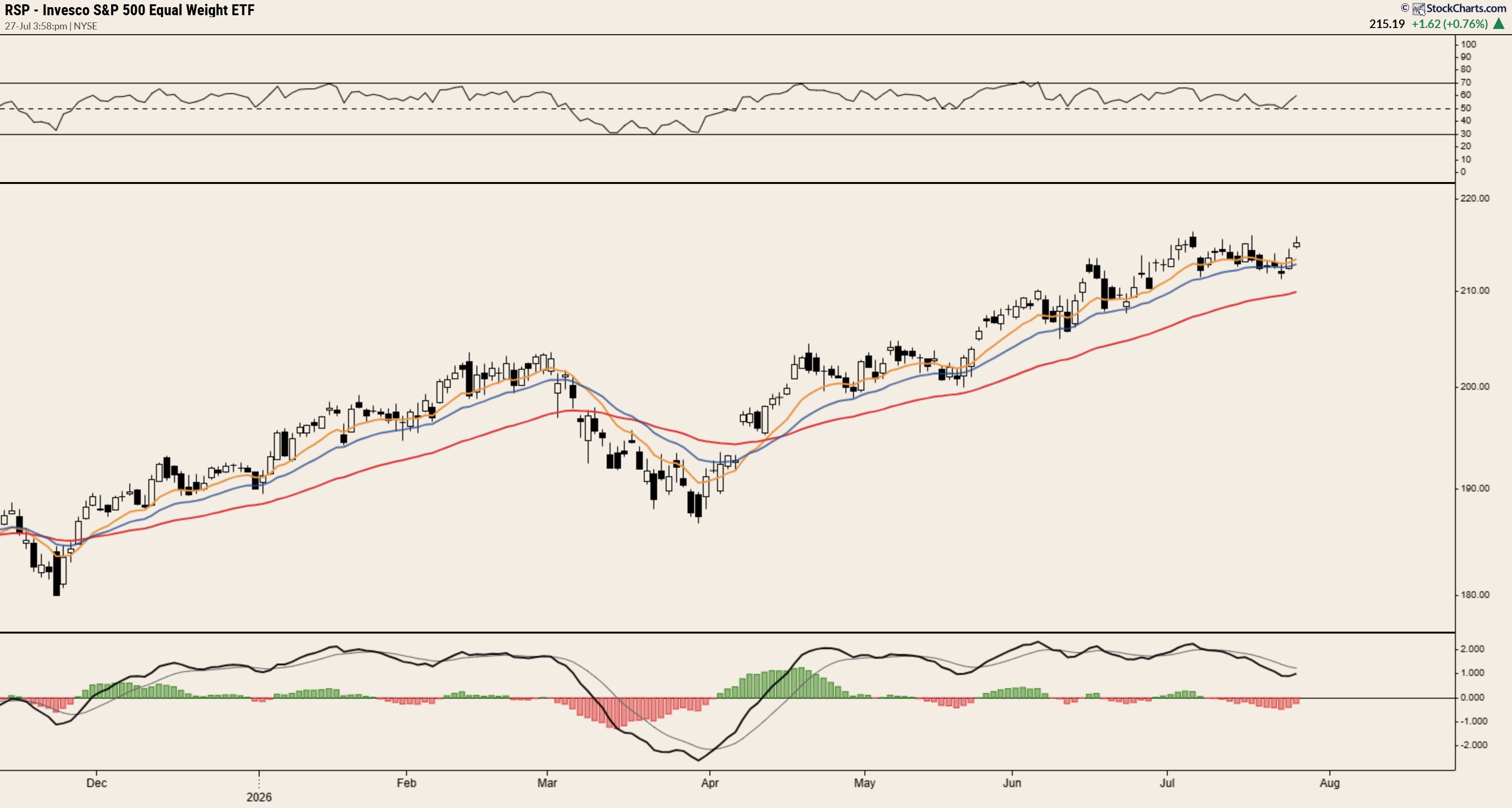
And yet despite these warning shots being fired, the simple fact is that so many charts outside of tech refuse to quit - just look at the equal weight S&P…
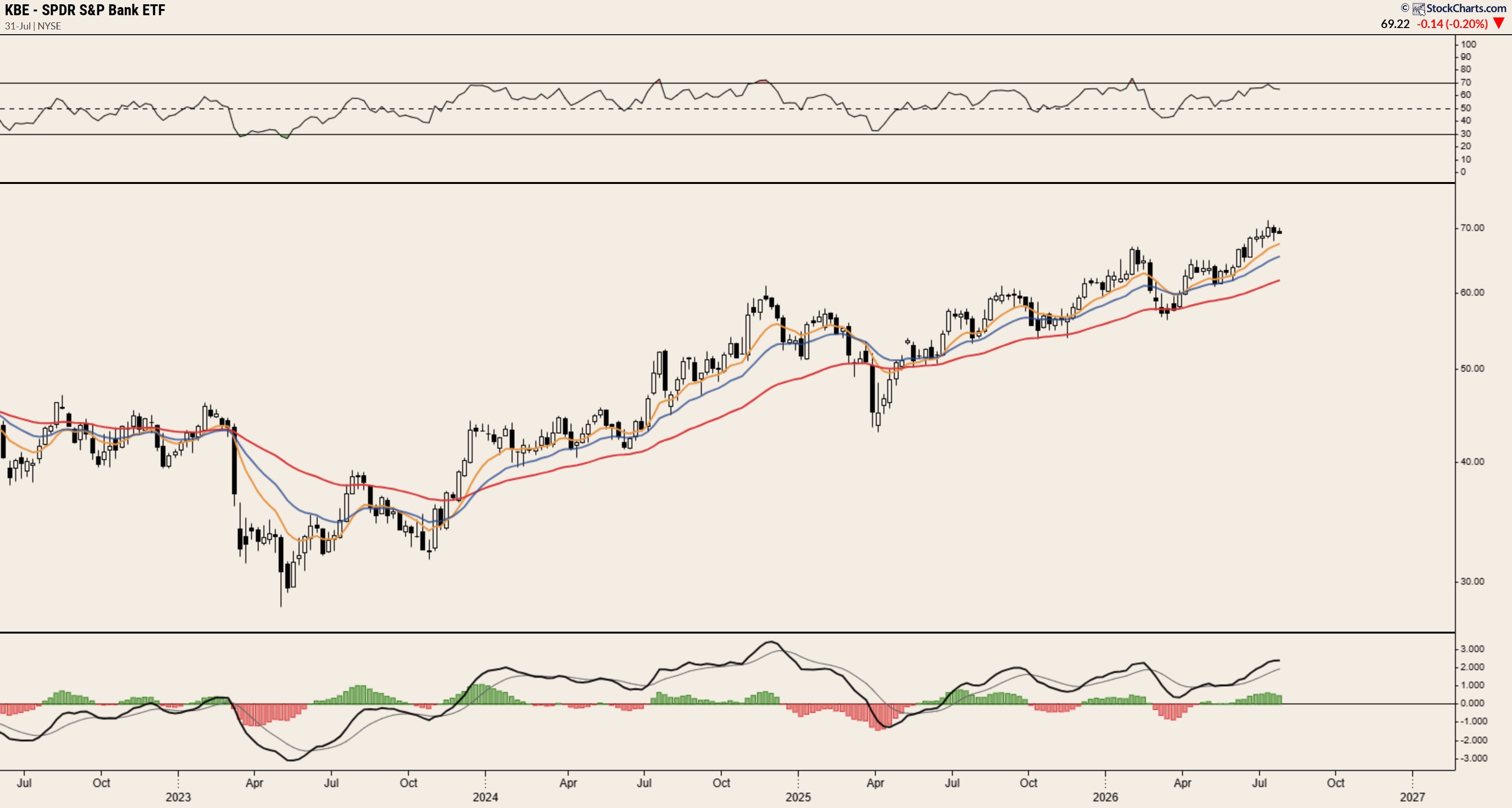
Look at banks…
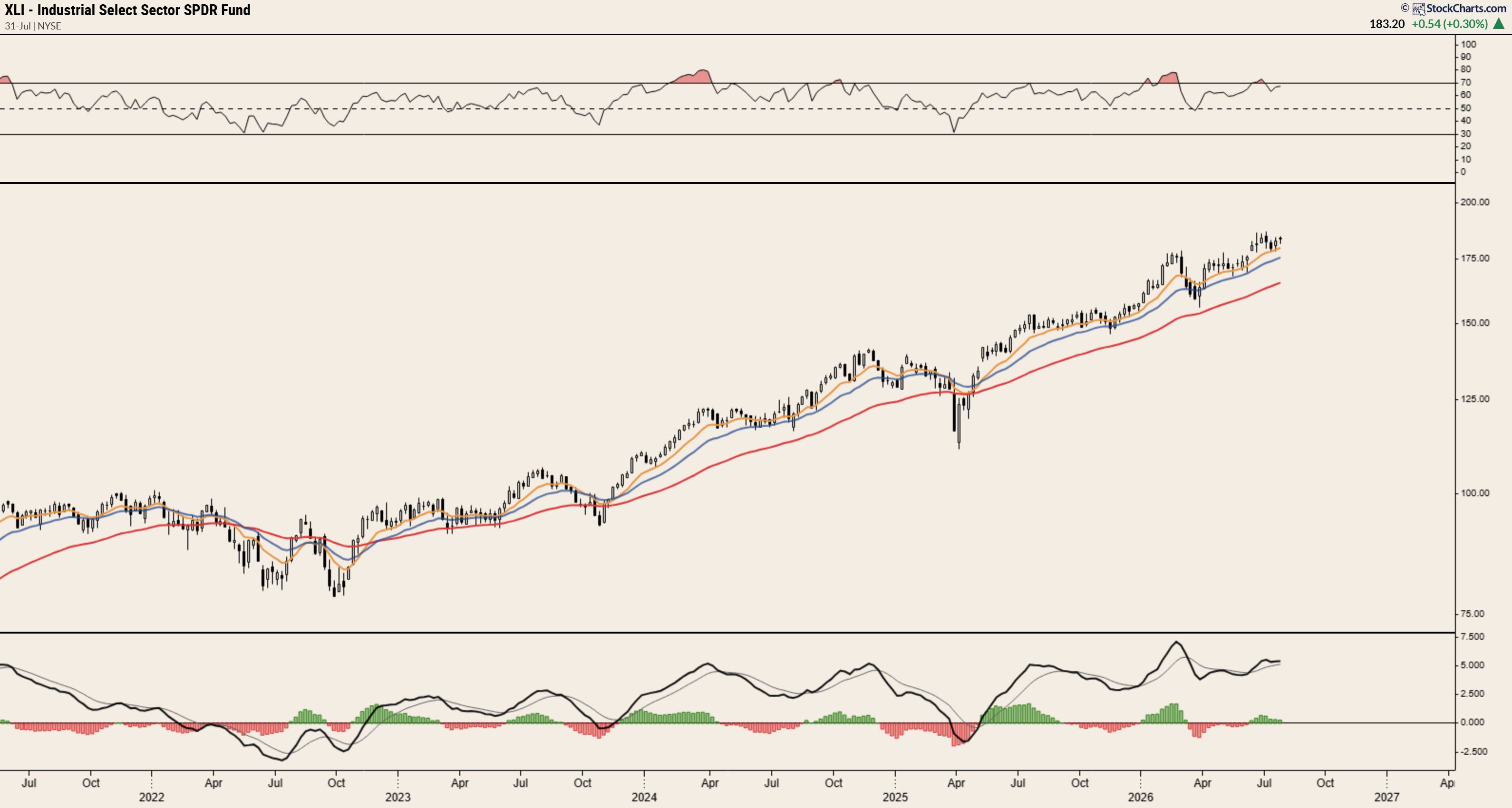
Look at industrials…
Look at healthcare…
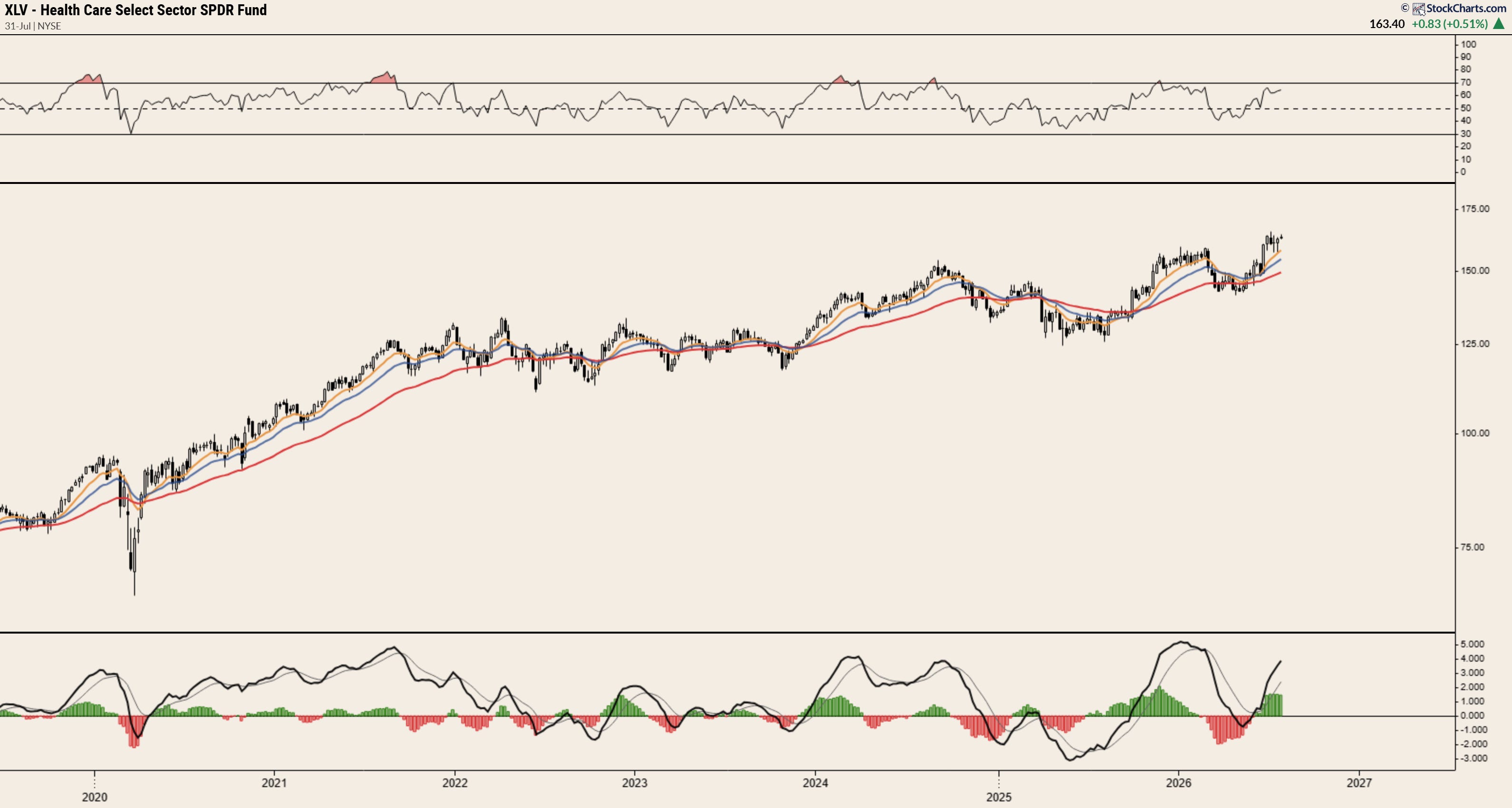
All of these charts are definitively bullish. That’s not an opinion, it’s straight up fact - higher highs, higher lows, all trending up and to the right above key moving averages.
So what’s going on?
At times like this, the traders who dismissed narratives on the way up are often the first to reach for one on the way down.
It’s just deleveraging. It’s just tech. It’s just Iran.
Maybe they’re right. Maybe they’re not.
But the market doesn’t care about the story you’re telling yourself. It cares about price. And right now, price is telling us that tech is starting to look heavy - like, real heavy.
Could this change post-FOMC? Could we see IGV finally reclaim the 200dma and inspire tech bulls to rotate out of names like TSM, NVDA and ALAB back into laggards such as PLTR, MSFT and NOW?
Maybe.
Or maybe this is simply the market reminding us that leadership rotates, not all corrections end the same way, and the only thing more expensive than buying weakness is blindly buying every weakness.
Either way, I’m not particularly interested in guessing.
Instead, I’m happy sitting on my hands and waiting for the tape to show me the way. Boring, but ain’t that just the game?
Best,
Alex