
The Matrix
"I know this bull market doesn't exist..."


In The Matrix, comfort is nothing more than a carefully constructed illusion - one that exists only because people choose it over the truth.
The truth is there. Raw, unfiltered, unavoidable.
But most people don’t want it.
They want the version of reality that feels better - familiar, reassuring, easy to accept.
Not because it’s right…but because it’s comfortable.
Cypher says it best as he cuts into a steak he knows isn’t real:
“You know, I know this steak doesn't exist. I know that when I put it in my mouth, the Matrix is telling my brain that it is juicy and delicious. After nine years, you know what I realize? Ignorance is bliss.”
Which brings us to where we’re at in this bull cycle.
Not believing in new highs because the data suggests that’s where we’re headed, but because new highs are the steak this market’s been feasting on since October 2022.
New highs are delicious. New Highs are familiar.
But are they real, or a work of fiction?
The Red Pill
Unlike human beings, which are susceptible to cognitive dissonance, bias and herd mentality, markets don’t care what we believe - they simply reflect what is.
And what is right now, ain’t your Grandmother’s bull market.
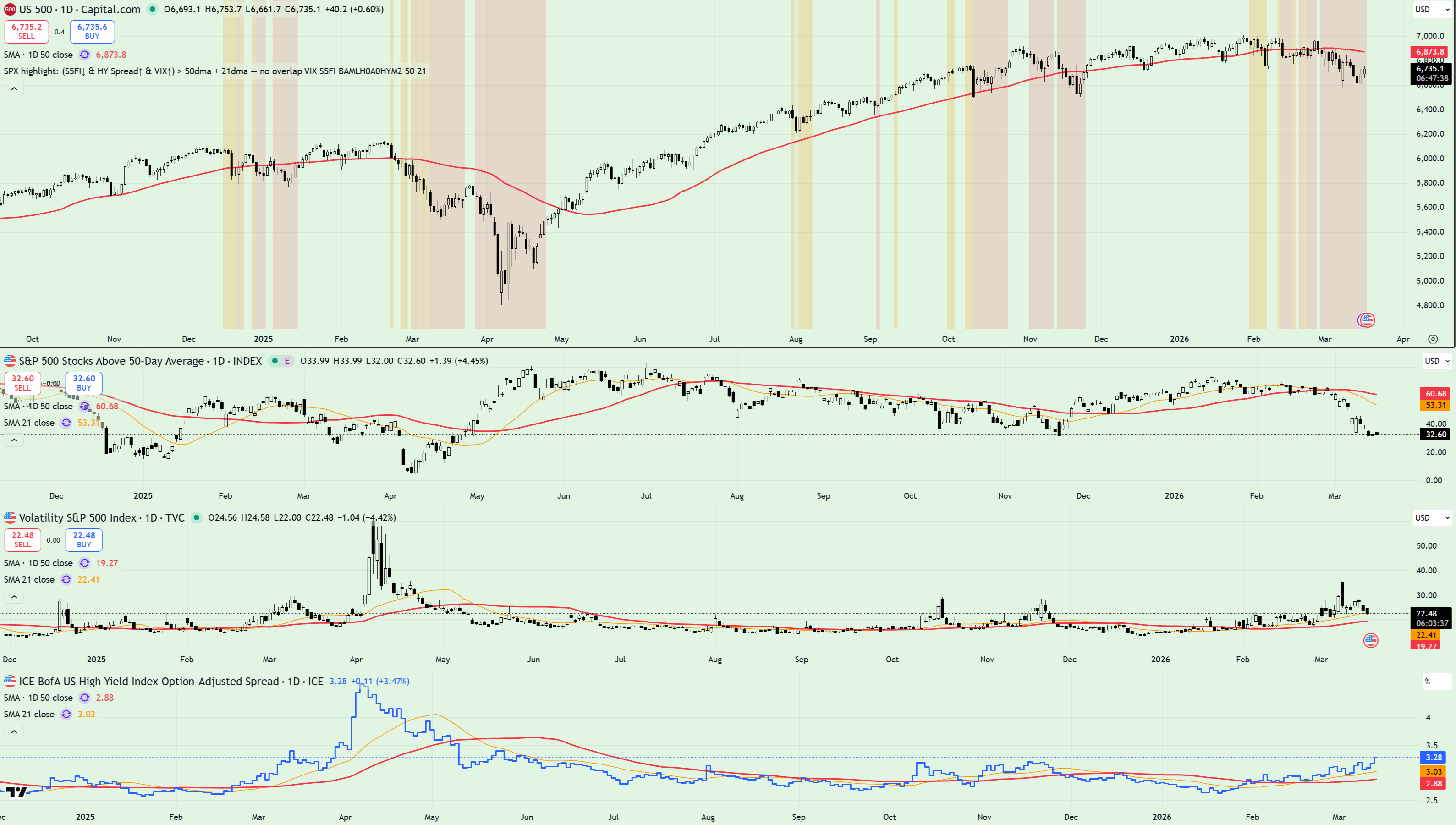
What the chart above shows is simple - my primary Risk Model which tracks three core datasets: short term breadth, volatility and credit spreads.
Here’s how each of these look in isolation, starting with volatility.
The VIX remains in an uptrend, with key moving averages showing bullish alignment.
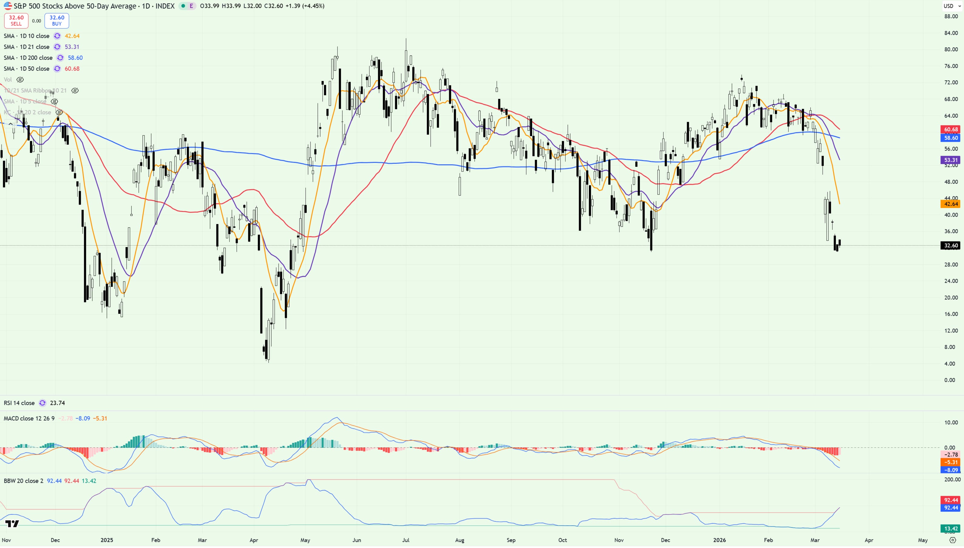
Next up, breadth - specifically the percentage of S&P 500 stocks trading above their 50dma - sitting at the lowest level since November, below all key moving averages.
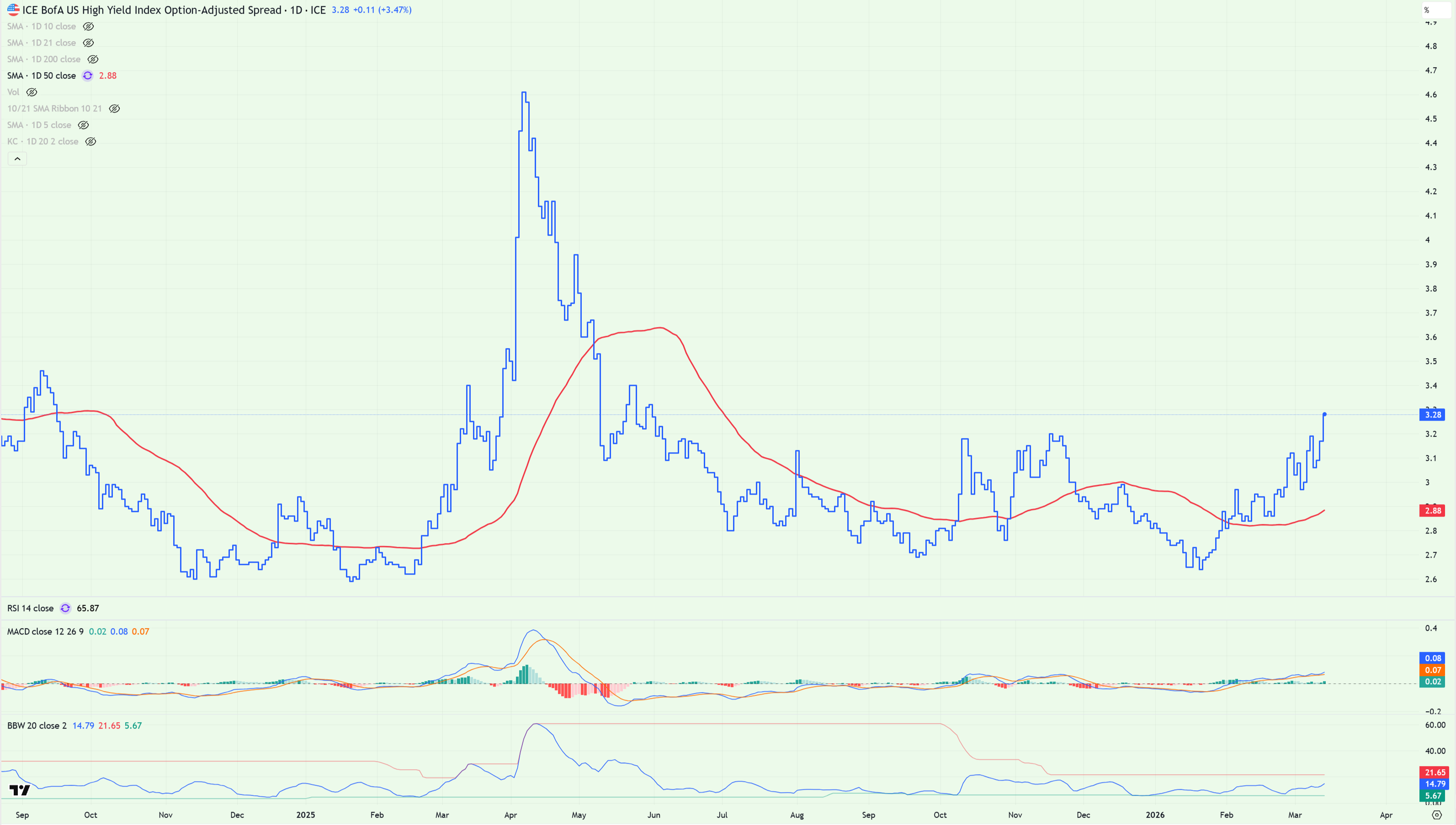
And lastly, Credit Spreads. Sure, low by historical standards, but clearly in an uptrend above the 50dma - closing out yesterday at multi-month highs.
Digging Deeper
For weeks now I’ve been pounding the table on moving averages, specifically how useless they are as a means to measure market structure in a sideways trending tape.
For those that missed these ramblings, take note: moving averages are great, but only in trending markets. Which brings us to where we are today.
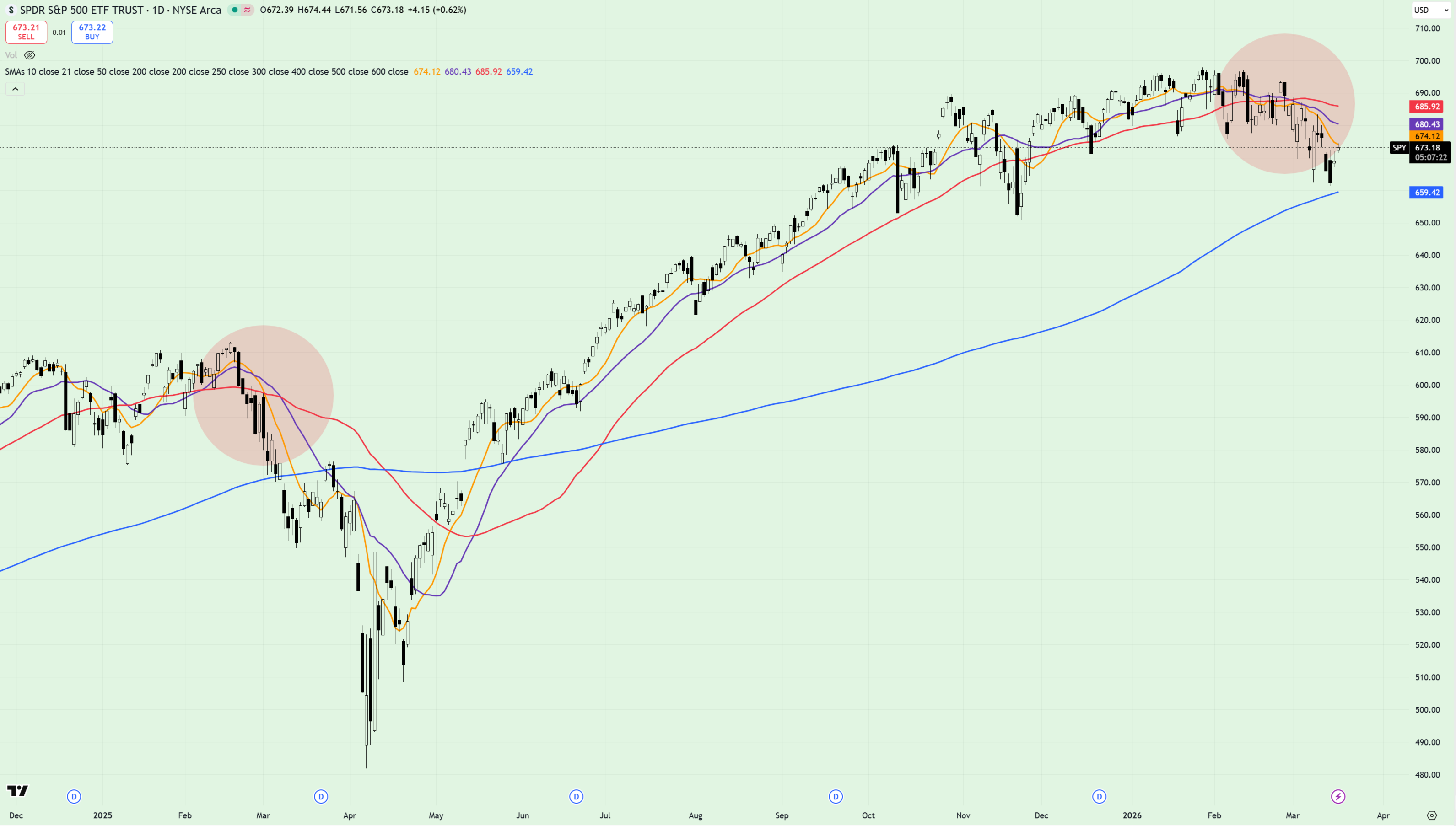
Where once I was reluctant to apply the moving average ensemble (I use the 10dma, 21dma, 50dma, 200dma FWIW) to the SPY chart, I’ve now decided to load’em up.
Why? For the first time since Q3 of last year, we might finally have a trending tape, confirmed by price making lower lows and lower highs on the daily timeframe dating back to February 25. Sure, it’s a short term trend, but in this tape, I’ll take it.
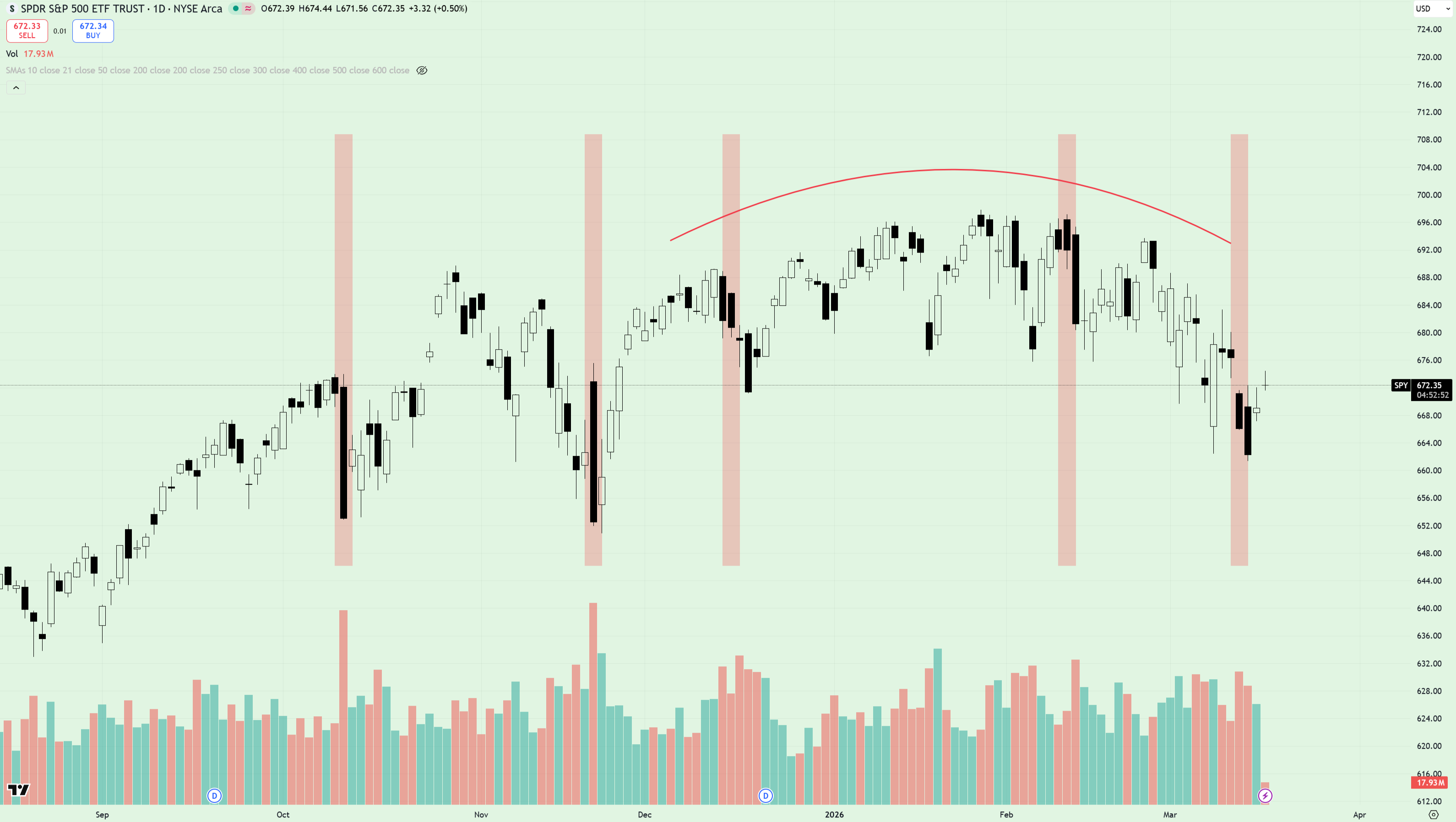
Zooming in, I’d also like to highlight a point that my friend John has been making for a number of weeks now - namely the distribution pattern that’s been in play on SPY dating back to October 2025, confirmed by significant volume spikes on red days, compared to green (denoted by red vertical bars on the chart above).
Confession time - I was reluctant to buy into this take at first, but since SPY looks to be completing a textbook rounded top pattern, just in time for tomorrow’s FOMC no less, I’m now seeing what John first spotted almost 3 months ago. I guess that’s what 30 years trading experience vs 3 years looks like. Kudos, John!
[Side note, John has recently started his own Substack publication and I couldn’t recommend it highly enough.]
Sector Analysis
Whilst I predominantly trade SPY, a great deal of value remains to be found by looking at the wider landscape on an intraday and weekly basis.
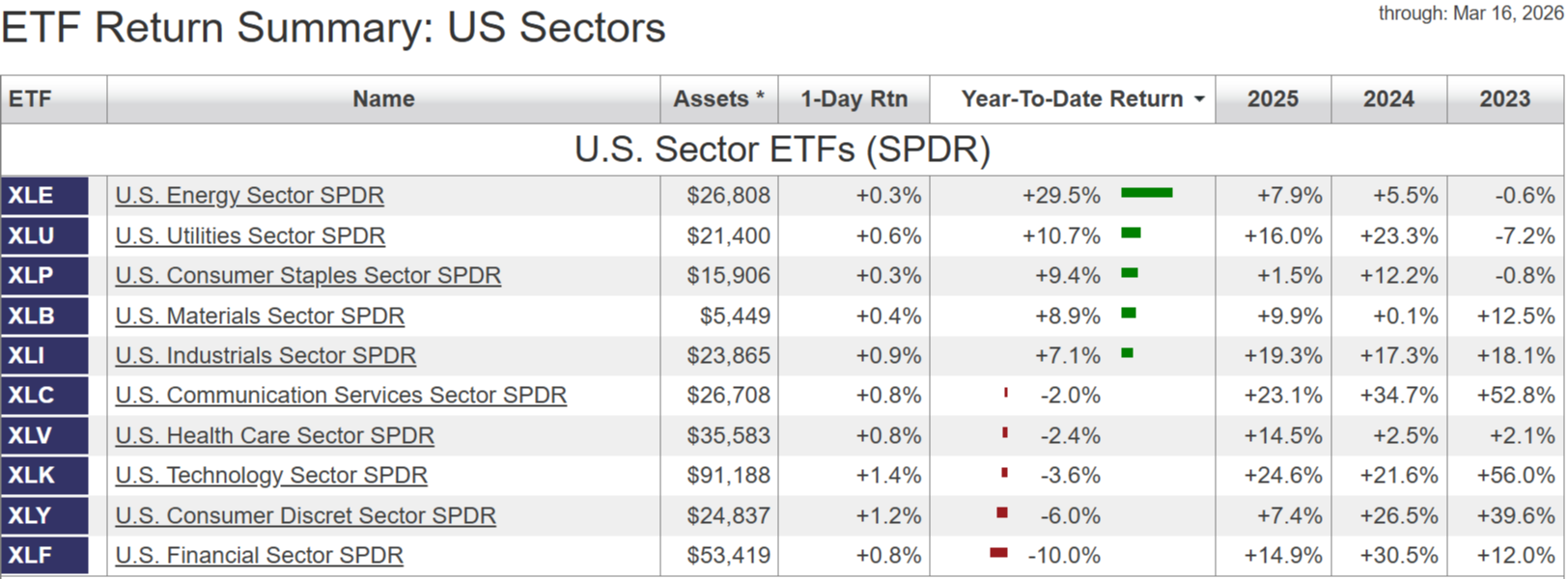
What this kind of analysis tells us is that since the turn of the year, the biggest winners have been Energy (+29.5%), Utilities (+10.7%) and Consumer Staples (9.4%). As for the losers, cast your eyes to the bottom of the table and you’ll see Financials, down 10%. Not a great look if you’re bullish.
Throughout February I recall people scrambling to the ‘rotation’ thesis to justify the clear disconnect between the market leaders (defensive sectors) and laggards (growth stocks, financials) - piecing together the smartest sounding thesis they could come up with to explain why the market remained ‘healthy’ despite all the evidence to the contrary.
And yet the crux of the matter was and still is quite simple: leadership matters. And for the best part of six months, this market hasn’t had any…
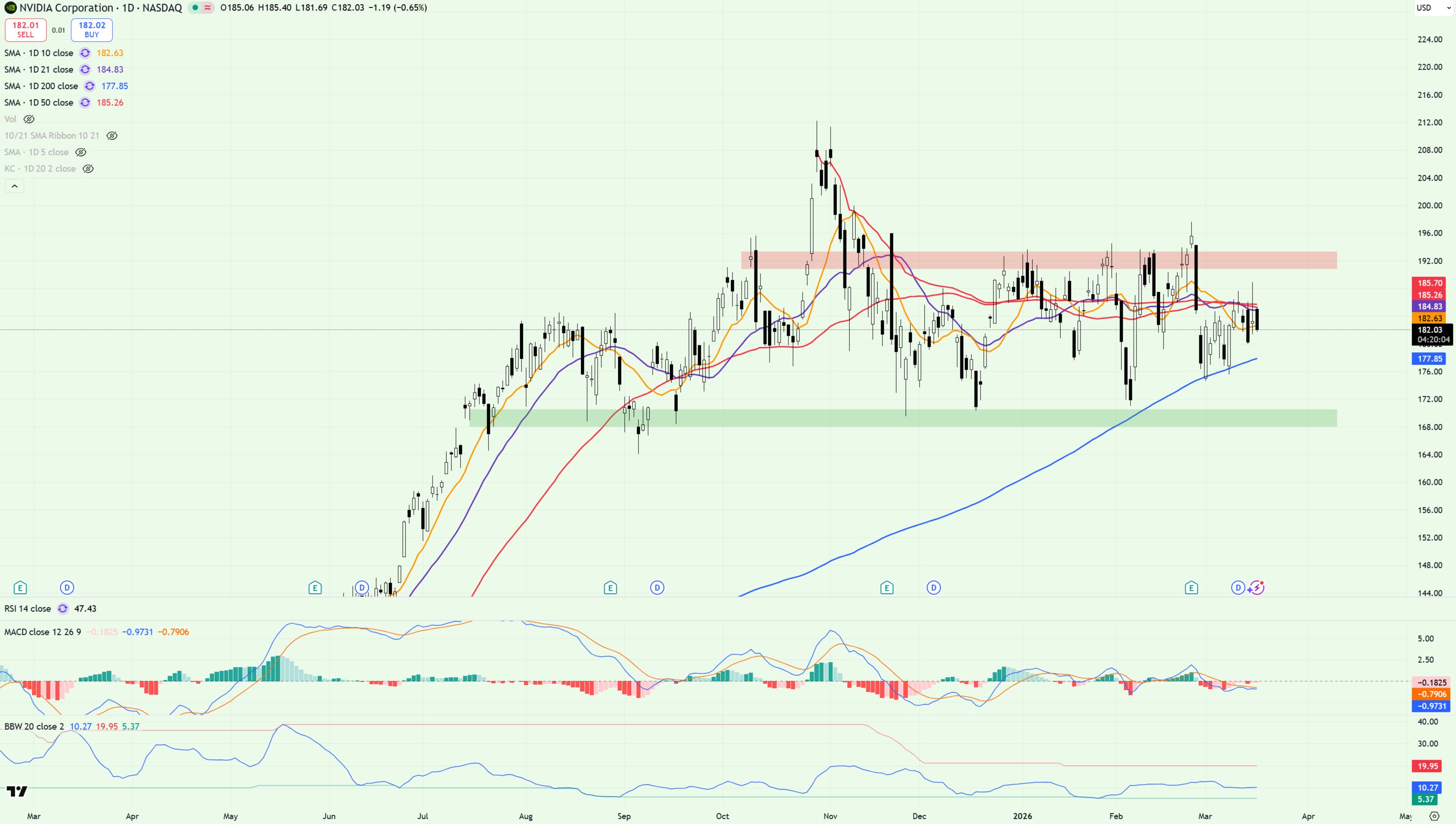
…just take a look at NVDA if you don’t believe me. Trapped between support and resistance for three consecutive quarters - failing to break below 170 or above 200, offering little clue as to when this broad range will resolve.
And then there’s MAGS…
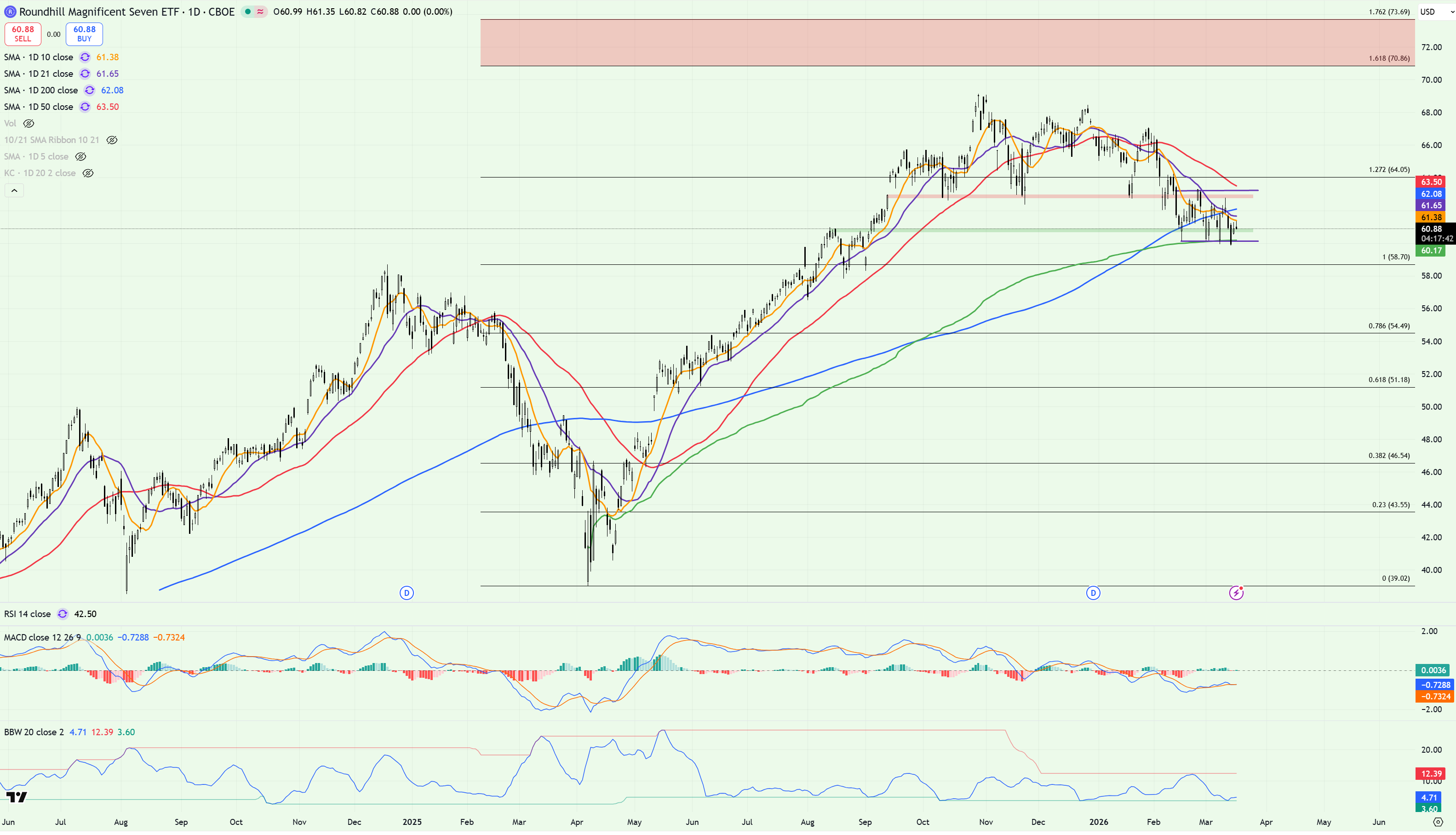
…bear flagging below key moving averages, breaking to multi-week lows with the VWAP from the April lows looking weaker by the day.
So Why Are You Bullish, Anon?
For the best part of three years, bears were the butt of the joke.
With dip buyers scooping up calls like tiramisu, the market’s relentless march to all time highs became a weekly phenomenon, supported by upwardly mobile MACDs, supporting moving averages and Fibonacci extensions so high they’d make your nose bleed.
It felt easy.
Predictable.
Comfortable.
Like the Matrix, it was a version of reality that worked - until it didn’t.
If today’s pill is red, yesterday’s was blue.
And right now, it’s effects are starting to wear off.
The trends aren’t as clean.
The leadership isn’t as strong.
The signals that once worked are starting to fail.
The market hasn’t broken - but the illusion of ease has.
And the sooner traders accept that they’re no longer operating in the same environment, the better equipped they’ll be to navigate what comes next.
Because this year isn’t about comfort.
It’s about seeing things for what they are.
Best,
Alex